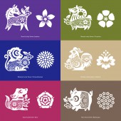
Yun Tea Premium Gift by Jacky Hoi Hung Cheung |
Home > Winners > #55121 |
 |
|
||||
| DESIGN DETAILS | |||||
| DESIGN NAME: Yun Tea PRIMARY FUNCTION: Premium Gift INSPIRATION: Identity is the theme for defining this project. During my research, I have considered the relationship between personal identity and cultural traditions, as well as any idea that evokes my characteristic of Anglo-Chinese cultural background. Tea culture is very popular with both British and Chinese people, the ritual of tea drinking with cross-over of two cultures could provide a wealth of research areas. UNIQUE PROPERTIES / PROJECT DESCRIPTION: A premium tea gift collection with the concept of Chinese zodiac and horoscopes, incorporating a bilingual brand identity, that helps to promote this Chinese cultural tradition to the worldwide people through an innovative approach and contemporary tone of voice. The graphic style of western chinoiserie willow pattern has been manipulated with the eastern Chinese papercutting zodiac character, that creating a unique visual identity which is related to tea and zodiac lucky flower. OPERATION / FLOW / INTERACTION: The concept of tag design is simple and intuitive, QR code is printed on the back of the leaf-shaped tag, which is encouraged to be scanned with any mobile phone, which is linked up with the specific horoscope website dedicatedly created for the purpose of presenting the monthly luck prediction, that can be in sync with the exact present month of site browsing. So people can view the more detail infographic of their horoscope while enjoying a cup of tea. PROJECT DURATION AND LOCATION: Apr - Aug 2016 in Hong Kong FITS BEST INTO CATEGORY: Graphics, Illustration and Visual Communication Design |
PRODUCTION / REALIZATION TECHNOLOGY: Each set of teapot-shaped packaging will be printed with one spot colour on a high quality corrugated paper. SPECIFICATIONS / TECHNICAL PROPERTIES: Teapot-shaped packaging: Width 120 mm x Depth 140 mm x Height 240 mm Individual tea-bag packaging: Width 65 mm x Depth 56 mm x Height 45 mm TAGS: tea, packaging, flowering-tea, chinese zodiac, chinese horoscope, lucky, fortune, identity, chinoiserie, willow pattern RESEARCH ABSTRACT: My research essay: "The interpretation of Orientalism and Semiotics in Anglo-Chinese tea culture". Related blog post - "https://jackyc CHALLENGE: I've conducted further research on the contemporary reinterpretations of chinoiserie willow pattern from some modern graphic designers to help contextualise my zodiac identity design. For the packaging material, I've explored the corrugated paper net as well as the wooden box approaches for my idea development of teapot-shaped packaging and finally, I've chosen paper as it's more eco-friendly. Regarding the typographic issue, I've compared several English typefaces with my Chinese brand identity, and eventually "Klinic Slab" has been chosen as the final decision. ADDED DATE: 2017-02-26 07:25:13 TEAM MEMBERS (1) : Jacky Cheung IMAGE CREDITS: Jacky Cheung, 2016. |
||||
| Visit the following page to learn more: http://goo.gl/LxL1PK | |||||
| AWARD DETAILS | |
 |
Yun Tea Premium Gift by Jacky Hoi Hung Cheung is Winner in Graphics, Illustration and Visual Communication Design Category, 2016 - 2017.· Read the interview with designer Jacky Hoi Hung Cheung for design Yun Tea here.· Press Members: Login or Register to request an exclusive interview with Jacky Hoi Hung Cheung. · Click here to register inorder to view the profile and other works by Jacky Hoi Hung Cheung. |
| SOCIAL |
| + Add to Likes / Favorites | Send to My Email | Comment | Testimonials | View Press-Release | Press Kit | Translations |
Did you like Jacky Hoi Hung Cheung's Graphic Design?
You will most likely enjoy other award winning graphic design as well.
Click here to view more Award Winning Graphic Design.


