VOOT Brand and Visual identity by ELEPHANT DESIGN PVT LTD |
Home > Winners > #54925 |
 |
|
||||
| DESIGN DETAILS | |||||
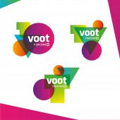
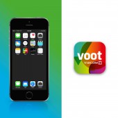
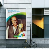
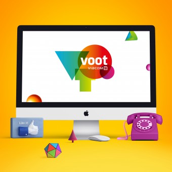
| DESIGN NAME: VOOT PRIMARY FUNCTION: Brand and Visual identity INSPIRATION: Voot is an online entertainment arm of Viacom 18 and was named so bearing in mind the spirit of celebration and sheer fun. Woot is a term used to express elation, enthusiasm, or triumph and brand Voot was set out to make viewers experience all of that and more. The premise of the brand was happiness with all its facets and was aimed at all age groups and collective viewing as opposed to some of its competitors that promoted individualistic viewing. UNIQUE PROPERTIES / PROJECT DESCRIPTION: Since the identity was being designed for a digital platform, we envisaged an identity that would be more playful, dynamic and surprising. Simple geometric shapes were used for the alphabets V O O T to connote an effortless, approachable brand. These shapes were infused with vibrant and delightful colour gradients to connote euphoria. One layout was finalized as a master logo that would be used on all communication whereas others could be used in various other scenarios like app, digital screens OPERATION / FLOW / INTERACTION: The master logo clipped in a rounded square became a unique and suitable app icon. A uniform visual language constructed from the vibrant colour overlaps and curves was devised to bring alive the brand communication PROJECT DURATION AND LOCATION: August 2015 to March 2016 Pune INDIA FITS BEST INTO CATEGORY: Graphics, Illustration and Visual Communication Design |
PRODUCTION / REALIZATION TECHNOLOGY: DIGITAL SPECIFICATIONS / TECHNICAL PROPERTIES: - TAGS: Visual identity, Brand, Digital, mobile first, voot RESEARCH ABSTRACT: With the changing nature of media it is essential that brand identities also evolve to be far more contemporary and dynamic in their expression. This was the thought starter when we began work on the identity design program for Voot. Research indicated that in the Indian environment, entertainment is consumed more in groups, big or small than individually. Whether it is a cricket match, a reality show, a movie or even adverts, Indians believe in collective viewing as an experience. CHALLENGE: Most of the entertainment brands in the competitive scenario focused on being hi-tech, new-age, sleek and for individual consumption. Whereas entertainment is more of an emotional experience than a functional or technical one. We needed to connect with the core Indian viewer and make him believe that Voot is all about sharing and the happiness created thereof. It was a challenge to bring about these spectrum of emotions merely through a visual identity and yet be relevant to times and contemporary in expression. We managed to create an identity that not only connoted happiness but was also neutral to all age groups, geographies and gender. ADDED DATE: 2017-02-25 07:23:57 TEAM MEMBERS (3) : Designer : Priyanka Karyekar, Manager : Kedar Parundekar and Design Director : Mayuri Nikumbh IMAGE CREDITS: ELEPHANT DESIGN PVT LTD , 2016. PATENTS/COPYRIGHTS: 3080304 41 3080305 42 3080303 38 3080302 9 |
||||
| Visit the following page to learn more: http://www.elephantdesign.com/ | |||||
| AWARD DETAILS | |
 |
Voot Brand and Visual Identity by Elephant Design Pvt Ltd is Winner in Graphics, Illustration and Visual Communication Design Category, 2016 - 2017.· Read the interview with designer ELEPHANT DESIGN PVT LTD for design VOOT here.· Press Members: Login or Register to request an exclusive interview with ELEPHANT DESIGN PVT LTD . · Click here to register inorder to view the profile and other works by ELEPHANT DESIGN PVT LTD . |
| SOCIAL |
| + Add to Likes / Favorites | Send to My Email | Comment | Testimonials | View Press-Release | Press Kit |
Did you like Elephant Design Pvt Ltd's Graphic Design?
You will most likely enjoy other award winning graphic design as well.
Click here to view more Award Winning Graphic Design.


