Safe - Urban Beachwear Rebranding by Max Bosio - Nascent Design team |
Home > Winners > #54803 |
 |
|
||||
| DESIGN DETAILS | |||||
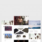
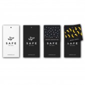
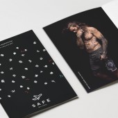
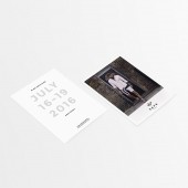
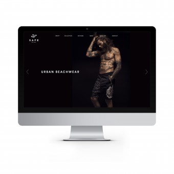
| DESIGN NAME: Safe - Urban Beachwear PRIMARY FUNCTION: Rebranding INSPIRATION: We have been inspired by the story of brand. A story made by several trips and experiences all around the world. This is the spirit of Safe brand, where the metropolitan vibe meets the trendy beach lifestyle, blanded into a casual, elegant and refined style. So the iconic symbol of the airplane is not only a formal element of the company’s identity but it is also the most significant element with the greatest visibility and awareness. We wanted to develop a logo and a new brand identity that remained faithful to positive thinking and engaging personality expressing attributes like unexpected, unconventional and cosmopolitan. UNIQUE PROPERTIES / PROJECT DESCRIPTION: Design of the new Identity system The new brand image was followed by restyling of the global brand identity. The company’s profile, stationary elements, product element (ticketing and labelling), internal documents and web site as a natural evolution of its new identity. The graphic design reflects everywhere a clean, elegant and minimal style. OPERATION / FLOW / INTERACTION: - PROJECT DURATION AND LOCATION: The project started in January 2016 in Milan and finished in July 2016 in Milano. |
PRODUCTION / REALIZATION TECHNOLOGY: - SPECIFICATIONS / TECHNICAL PROPERTIES: Ticketing and labelling, 55x100 mm. TAGS: Minimal, sophisticated, evokative, contemporary, clean, urban RESEARCH ABSTRACT: The concept design was anticipated by a benchmarking analysis about the general look & feel of the best competitors, italians and foreigners. CHALLENGE: The biggest challenge of the design was to convert the brand identity from a technical brand to a more emotional and evokative one. ADDED DATE: 2017-02-24 14:54:37 TEAM MEMBERS (1) : Nascent Design Team IMAGE CREDITS: Max Bosio - Nascent Design team, 2016. |
||||
| Visit the following page to learn more: http://www.safemilano.com/ | |||||
| AWARD DETAILS | |
 |
Safe-Urban Beachwear Rebranding by Max Bosio-Nascent Design Team is Winner in Graphics, Illustration and Visual Communication Design Category, 2016 - 2017.· Read the interview with designer Max Bosio - Nascent Design team for design Safe - Urban Beachwear here.· Press Members: Login or Register to request an exclusive interview with Max Bosio - Nascent Design team. · Click here to register inorder to view the profile and other works by Max Bosio - Nascent Design team. |
| SOCIAL |
| + Add to Likes / Favorites | Send to My Email | Comment | Testimonials | View Press-Release | Press Kit |
Did you like Max Bosio-Nascent Design Team's Graphic Design?
You will most likely enjoy other award winning graphic design as well.
Click here to view more Award Winning Graphic Design.


