The Cutting Edge Dispensing Pharmacy by Tetsuya Matsumoto |
Home > Winners > #54736 |
 |
|
||||
| DESIGN DETAILS | |||||
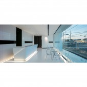
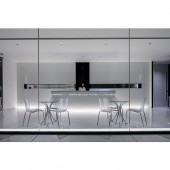
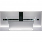
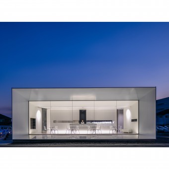
| DESIGN NAME: The Cutting Edge PRIMARY FUNCTION: Dispensing Pharmacy INSPIRATION: The keyword for medical related design is healing, commonly associated with peaceful nature. As a result, this type of design traditionally tries to incorporate natural elements like trees, green walls and flowers. Nonetheless, the simple fact of coming to a medical institution lays on the trust that the patient puts on modern medicine. The more advanced medicine is the more trustworthy it becomes; true peace of mind is reached when the medical care is at its Cutting Edge. UNIQUE PROPERTIES / PROJECT DESCRIPTION: This design for a dispensing pharmacy, related to a neighboring general hospital, uses pure white minimalistic space with sharp surfaces and edges to produce the cutting edge high-tech impression on the users of the pharmacy fitting the image of an advanced medical care technology. OPERATION / FLOW / INTERACTION: The minimalistic design of this pharmacy goes along with high quality services while remaining simple and intuitive. The patient is received at the reception counter and submits his prescription. The pharmacist then prepares the prescription in the backyard while the client is sitting comfortably in the waiting space furnished with tables and chairs. When the preparation is done, the pharmacist joins the patient in his table to provide the medicines and the explanation required to each of them. PROJECT DURATION AND LOCATION: Project start: January 2016. Construction start: September 2016. Project/Construction End: January 2017. Location, Designed and constructed in: Himeji City, Japan. FITS BEST INTO CATEGORY: Architecture, Building and Structure Design |
PRODUCTION / REALIZATION TECHNOLOGY: The building structure was constructed using a metallic frame on which metallic panels covers the exterior walls and plaster-boards for the interior walls. The protracted part was covered in thin mat white metallic panels with low-density foam core. The sharp edges were made by using aluminum sheets. The glass used in the facade is a 19mm float glass. The interior wall behind the reception counter was covered by special wood panels adding a sharper atmosphere to the inside. SPECIFICATIONS / TECHNICAL PROPERTIES: Gross Built Area: 150sqm W12410mm x D11965mm x H4520mm TAGS: Pharmacy, japan, medical, retail, architecture, interior, minimalism, sharp RESEARCH ABSTRACT: The research for this project was conceptual and aesthetic at the same time. How to make a pharmacy user, or a passenger passing by it, understand that this pharmacy provides the best medicines? And how could it be outstanding compare to other dispensing pharmacies. The starting point is to think about what was the expectation that a patient would have from this institution, the answer was: Healing. The next step was a research of how to objectify the concept of healing. CHALLENGE: The neighboring Hospital is in a shifting process to renew its image and improve its service. Offering a dispensing pharmacy was one of the key shifts and an excellent opportunity to give passing by people a glimpse of this renewal, especially that it is located at the side of one of the major and busiest roads in the region. The challenge was then to design a pharmacy building, small in size, small in budget, that is capable of producing an impressive effect and be functional at the same time. ADDED DATE: 2017-02-24 09:56:21 TEAM MEMBERS (1) : IMAGE CREDITS: Image #1: photographer ©Stirling Elmendorf, Pharmacy, 2016. Image #2: photographer ©Stirling Elmendorf, Pharmacy, 2016. Image #3: photographer ©Stirling Elmendorf, Pharmacy, 2016. Image #4: photographer ©Stirling Elmendorf, Pharmacy, 2016. Image #5: photographer ©Stirling Elmendorf, Pharmacy, 2016. |
||||
| Visit the following page to learn more: http://ktx.space/ | |||||
| AWARD DETAILS | |
 |
The Cutting Edge Dispensing Pharmacy by Tetsuya Matsumoto is Winner in Architecture, Building and Structure Design Category, 2016 - 2017.· Read the interview with designer Tetsuya Matsumoto for design The Cutting Edge here.· Press Members: Login or Register to request an exclusive interview with Tetsuya Matsumoto. · Click here to register inorder to view the profile and other works by Tetsuya Matsumoto. |
| SOCIAL |
| + Add to Likes / Favorites | Send to My Email | Comment | Testimonials | View Press-Release | Press Kit | Translations |
Did you like Tetsuya Matsumoto's Architecture Design?
You will most likely enjoy other award winning architecture design as well.
Click here to view more Award Winning Architecture Design.


