DESIGN NAME:
JinYuan
PRIMARY FUNCTION:
Brand Design
INSPIRATION:
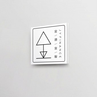
In order to reduce the people's "gold" (money) generated by the interests of the sensitivity, to get rid of the "gold" of the traditional cognitive suspects, to create the image of platinum, so the "golden"font design, slender and powerful, Exquisite service attitude and quality such as the spirit of the integrity of gold.
UNIQUE PROPERTIES / PROJECT DESCRIPTION:
To further strengthen the professionalism of the company's financial services, from the " JY Financial Services" to extract the high frequency of the "gold" text as JY's new identification symbols, with simple, intuitive, easy to remember features, with the least language to tell others "Who are we" and "what we are doing."
OPERATION / FLOW / INTERACTION:
-
PROJECT DURATION AND LOCATION:
The project began in Shenzhen in October 2016 and was completed in Shenzhen in March 2017 and put into use
FITS BEST INTO CATEGORY:
Graphics, Illustration and Visual Communication Design
|
PRODUCTION / REALIZATION TECHNOLOGY:
Digital Printing
SPECIFICATIONS / TECHNICAL PROPERTIES:
Edit the brand manual, and then make a different related materials
TAGS:
Logo design, brand image, office materials, financial field
RESEARCH ABSTRACT:
In order to reduce the people's "gold" (money) generated by the interests of the sensitivity, to get rid of the "gold" of the traditional cognitive suspects, to create the image of platinum, so the "golden"font design, slender and powerful, Exquisite service attitude and quality such as the spirit of the integrity of gold.
CHALLENGE:
The biggest difficulty of this project is that from the logo itself to the entire brand of visual implementation are geometric lines to express the visual appearance, and different size is difficult to control the line thickness and density.
ADDED DATE:
2017-02-24 04:51:21
TEAM MEMBERS (1) :
IMAGE CREDITS:
Feng Lei, 2016.
|


