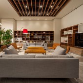
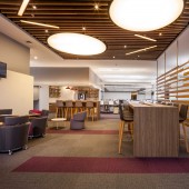
Aon Wellbeing environment by Juan Carlos Baumgartner |
Home > Winners > #54136 |
 |
|
||||
| DESIGN DETAILS | |||||
| DESIGN NAME: Aon PRIMARY FUNCTION: Wellbeing environment INSPIRATION: Continuing with this methodology we move to spaces focused on socializing, promoting casual encounters that intensify communication and collaborative work, and this leads to the immediate need to create innovative and empathetic solutions that respond to the experiences lived day to day. UNIQUE PROPERTIES / PROJECT DESCRIPTION: It is sought to dedicate zones specially designed for informal work as hubs that connect with the support areas, private spaces and the open work area that is situated in the area of the building where glass facade predominates which contributes constant access to natural light, making workers more productive and efficient, and creating energizing and dynamic environments. OPERATION / FLOW / INTERACTION: The success of this project is based on understanding the needs of the organization in order to convert the space into a competitive tool, creating an environment of elegance and modernity, with shades of light resulting from the multidisciplinary integration and from various factors. The strategic vision, centered on the user and based on evidence, are concepts and methodologies unique to Space, a leading firm in corporate design in Mexico and Latin America. PROJECT DURATION AND LOCATION: Aon is moving its corporate offices to Paseo de la Reforma, an important commercial and financial corridor of Mexico City, to continue from there integrating solutions of value for its clients, and taking care of its collaborators and the communities where it is located. The project started in April 2016 and finished in November 2016. FITS BEST INTO CATEGORY: Interior Space and Exhibition Design |
PRODUCTION / REALIZATION TECHNOLOGY: The finishings form an integral part of the project, combining them in a way that they complement one another, we reveal marble, carpets, glass, wood and furniture that emphasize the change of the different scenarios. In general warm colors predominate throughout the project but in some key points (walls, columns, carpets) bright tones were used according to a chromatic palette that unifies the image and helps to reinforce the identity of the company. SPECIFICATIONS / TECHNICAL PROPERTIES: contractor: Gia furniture: Haworth area: 5,550.00 sqm TAGS: corporate interior, wellbeing philosophy, modernity, competitive, productive, efficient, sustainable, experience life RESEARCH ABSTRACT: Seeking to renew not only its image but its entire way of working internally and externally, they decided to make use of the philosophy of Space, searching for an atmosphere of solidity and seriousness for the clients, creating an environment of modernity and integration toward the interior with key spaces that communicate the philosophy of the brand where users obtain greater commitment and wellbeing. CHALLENGE: The project is developed in a single building with an area of approximately 5,500 sqm, inspired in the commitment, participation and purpose of citizen movements that implement solutions in order to strengthen Mexican society; this is achieved through open functionality in order to achieve greater productivity and efficiency in a first-rate, interesting, collaborative and transparent work environment that reflects its corporate identity and promotes contact between its collaborators and leaders. ADDED DATE: 2017-02-21 02:57:55 TEAM MEMBERS (10) : Space: Juan Carlos Baumgartner , Alejandro Danel Cendoya , Collaborators: Javier Gutiérrez Payro, Marcos Aguilar Flores, Triana García Velez, Luis Corona, Lighting: Lua , Contractor: Gia, Furniture: Haworth and Photography: Paul Czitrom IMAGE CREDITS: Photgrapher Paul Czitrom, 2016 Video Credits: Aon |
||||
| Visit the following page to learn more: http://spacemex.com/aon | |||||
| AWARD DETAILS | |
 |
Aon Wellbeing Environment by Juan Carlos Baumgartner is Winner in Interior Space and Exhibition Design Category, 2016 - 2017.· Read the interview with designer Juan Carlos Baumgartner for design Aon here.· Press Members: Login or Register to request an exclusive interview with Juan Carlos Baumgartner. · Click here to register inorder to view the profile and other works by Juan Carlos Baumgartner. |
| SOCIAL |
| + Add to Likes / Favorites | Send to My Email | Comment | Testimonials | View Press-Release | Press Kit |
Did you like Juan Carlos Baumgartner's Interior Design?
You will most likely enjoy other award winning interior design as well.
Click here to view more Award Winning Interior Design.


