Do the most sales of the design Corporate Identity by Si Hu |
Home > Winners > #53290 |
 |
|
||||
| DESIGN DETAILS | |||||
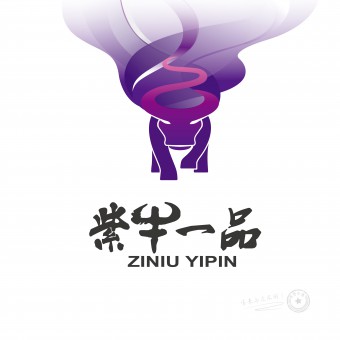
| DESIGN NAME: Do the most sales of the design PRIMARY FUNCTION: Corporate Identity INSPIRATION: Logo design came up with the name of the brand "Ziniu Yipin". "Ziniu"mea UNIQUE PROPERTIES / PROJECT DESCRIPTION: The logo is designed for a Chinese spirits company whose target customers are 20 to 35 years old adults. In China, most target customers of Chinese spirits are set as middle-aged men, therefore, the logo design style is more serious. Unlike others, the product image of Ziniu Yipin was designed as a bull. It breaks the common image of Chinese spirits brand and shows that the image could be younger and full of vital energy. OPERATION / FLOW / INTERACTION: The logo matches the brand name perfectly which it’s easy for customers to remember. The combination of bull’s horn and tail shows the sense of flow of Chinese spirits. In Chinese culture, bull represents honest and reliable which is meet the ideal image of the company. For the colour, gradient ramp was chosen to create the illusion of space to customers. Different colours can be applied on the logo based on the requirement of production operation. PROJECT DURATION AND LOCATION: The project started in May 2016 in Tianjin and finished in December 2016 in Tianjin. |
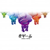
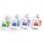
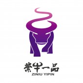
PRODUCTION / REALIZATION TECHNOLOGY: - SPECIFICATIONS / TECHNICAL PROPERTIES: 65 mm x 35 mm x 125 mm TAGS: Logo, Alcohol product, Drink, Branding, Product packaging, Advertising, Marketing RESEARCH ABSTRACT: In China, most logo design of Chinese spirits are inspired from the place of origin, ingredient like broomcorn, and historical background. The price is relatively high and target customers are set as middle-aged men, therefore, the design style is decorous, serious and has historical feeling. However, unlike those design style, the logo of Ziniu Yipin was designed as an animal—bull. Based on the analysis of target customers, the similarity of 20-35 adults are lilkely to be passionate and full of energy and never afraid of facing adversity. The image of bull represents the spirit appropriately. CHALLENGE: The obstacles are how to identify the logo in the first sight as an alcohol brand instead of other industry and how to combine bull and Chinese spirits together. Our solution is to combine bull’s horn and tail to show the sense of flow of Chinese spirits which seems like the evaporation process. Instead of using toneless homochromy, gradient ramp was chosen to balance the visual effect, makes logo more solid. ADDED DATE: 2017-02-09 08:16:11 TEAM MEMBERS (4) : Designer: Jie Liu, Designer: Yueshi Jin, Product Manager: Si Hu and IMAGE CREDITS: Image #1: Design Director Jie Liu, Ziniu Yipin logo, 2016 Image #2: Design Director Jie Liu, Ziniu Yipin logo series, 2016 Image #3: Design Director Jie Liu, Ziniu Yipin packaging , 2016 Image #4: Design Director Jie Liu, Ziniu Yipin packaging, 2016 Image #5: Design Director Jie Liu, Ziniu Yipin spring festival packaging, 2016 |
||||
| Visit the following page to learn more: http://www.sense-bd.com/show/226.html | |||||
| AWARD DETAILS | |
 |
Do The Most Sales of The Design Corporate Identity by Si Hu is Winner in Graphics, Illustration and Visual Communication Design Category, 2016 - 2017.· Read the interview with designer Si Hu for design Do the most sales of the design here.· Press Members: Login or Register to request an exclusive interview with Si Hu. · Click here to register inorder to view the profile and other works by Si Hu. |
| SOCIAL |
| + Add to Likes / Favorites | Send to My Email | Comment | Testimonials | View Press-Release | Press Kit |
Did you like Si Hu's Graphic Design?
You will most likely enjoy other award winning graphic design as well.
Click here to view more Award Winning Graphic Design.


