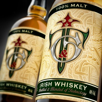
T and G Whiskey Packaging Design by ShumiLoveDesign |
Home > Winners > #53256 |
 |
|
||||
| DESIGN DETAILS | |||||
| DESIGN NAME: T and G PRIMARY FUNCTION: Whiskey Packaging Design INSPIRATION: The design was heavily inspired by Ireland and the common symbols associated with this country, namely the color green, the beautiful landscapes as well as its rich history and traditions. UNIQUE PROPERTIES / PROJECT DESCRIPTION: The marketing research undertaken before the creation of the design concept has shown that it's imperative to use emerald green in the design solution, because it's the national color of Ireland and consumers associate this color with the product's origin. The color of the bottle was intentionally chosen to be transparent in order to accentuate the honey-amber color of whiskey in it, which in turn work very well with the green of Irish fields and hills. OPERATION / FLOW / INTERACTION: The logo serves as an eye-stopper for the entire label composition. It draws the attention of the viewer, who then "discovers" PROJECT DURATION AND LOCATION: June 2014 - Novermber 2014, Moldova FITS BEST INTO CATEGORY: Packaging Design |
PRODUCTION / REALIZATION TECHNOLOGY: Quality paper with embossing and tactile varnish SPECIFICATIONS / TECHNICAL PROPERTIES: Label dimensions: 90 mm x 113 mm TAGS: valerii sumilov, shumilovedesign, t&g, whiskey, packaging design, label design, ireland RESEARCH ABSTRACT: Irish whiskey was highly regarded in England since the end of 19th century and that was the reason why we've developed a unique heraldic sign for the TG whiskey and placed it right in the center of the label. Such signs were used in family crests among the European nobility, and this became the style forming element for the entire project. CHALLENGE: The client has tasked us to create such a design that would allow the consumer to identify the product as original Irish whiskey. Besides we also had to emphisize the product's masculine, severe, Norse spirit. ADDED DATE: 2017-02-08 15:59:23 TEAM MEMBERS (1) : IMAGE CREDITS: ShumiLoveDesign, 2016. |
||||
| Visit the following page to learn more: http://shumilovedesign.eu | |||||
| AWARD DETAILS | |
 |
T and G Whiskey Packaging Design by Shumilovedesign is Winner in Packaging Design Category, 2016 - 2017.· Read the interview with designer ShumiLoveDesign for design T and G here.· Press Members: Login or Register to request an exclusive interview with ShumiLoveDesign. · Click here to register inorder to view the profile and other works by ShumiLoveDesign. |
| SOCIAL |
| + Add to Likes / Favorites | Send to My Email | Comment | Testimonials | View Press-Release | Press Kit | Translations |
Did you like Shumilovedesign's Packaging Design?
You will most likely enjoy other award winning packaging design as well.
Click here to view more Award Winning Packaging Design.


