ACP Alpha Container Pictures Corporate Design by Julia Hell |
Home > Winners > #53240 |
 |
|
||||
| DESIGN DETAILS | |||||
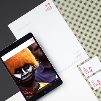
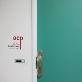
| DESIGN NAME: ACP Alpha Container Pictures PRIMARY FUNCTION: Corporate Design INSPIRATION: The focus during the whole design process was to create a unique corporate design that will work together with moving imagery. ACP has a strong focus on documentary films and coverages. We were aiming for a serious playfullness in a modern but also timeless way. The challenge was to find a way to transport these contrasting views into one design to resemble the brand. The research for the typography mix and color scheme were in the end influenced by the Container part of the companys name. UNIQUE PROPERTIES / PROJECT DESCRIPTION: This is a corporate design for a film production company based in Berlin. The Logo is a combination of the short form of the company name ACP and the complete name. I used two fonts, a stencil font which is often used on freight containers for shipping goods overseas plus a monospace typeface analogue to a typewriter but very technical. The Logo introduces also the color scheme of the corporate design which can be found in both, printed business documents and on the website OPERATION / FLOW / INTERACTION: In terms of the website, I focused on showing as much video content as possible, since this is what the company produces. Due to my research results this makes a huge difference when it comes to the presentation of the company. It is always valuable to show the actual product. This is why the design uses elements like e.g. navigation, Social Media icons thrifty. The page focuses on video and of course features news of upcoming projects and broadcasts. But the entrance to the website features fullscreen video imagery that show how emotional and impressive the work of acp is. And that at first sight. PROJECT DURATION AND LOCATION: The Project started in December 2015 in Berlin and is still ongoing, since the company is still growing an I am still in charge of new design tasks. We had two milestones with the release of the Logo and business papers in April 2016 and the launch of the website end of February in 2017. FITS BEST INTO CATEGORY: Graphics, Illustration and Visual Communication Design |
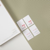
PRODUCTION / REALIZATION TECHNOLOGY: The Logo was designed in Adobe Illustrator, all print documents were layouted in Adobe InDesign. For the webdesign I tried Adobe XD for the first time to create a fully responsive design for the page. The website was later built in Drupal with SASS and jQuery. SPECIFICATIONS / TECHNICAL PROPERTIES: The Letterhead is a classical DIN A4 Format, 210 mm x 297 mm, the business card has dimensions of 55 mm x 85 mm. The website is fully responsive and adapts to all common device sizes. TAGS: Corporate Design, Branding, Logo, Business card, Webdesign, Website RESEARCH ABSTRACT: After the Briefing, I started a research of german TV and film production companies online. Assuming the websites, branding and identities of these companies to be very creative and up to date, since they produce creative content for a medium with such a high coverage of different target groups like mass medium TV, I was proven to be wrong. Many pages are outdated style wise or also technically. Plus all of these companies produce video content and non of the pages I came across, actually displayed one on their page. This made me decide to open big with actual video content. CHALLENGE: The hardest part was to find a typographical solution for the company Logo. In my first drafts I focused on the full name and the shortened Form was more of an accessory accompanying it. Then my client came up wit the idea of an actual container font he really liked and I started playing around with it and this time wit the short form as the center element. I liked the international aspect to the container font since the company is producing contend all around the globe. After some tests I combined it to a monospace font and then we were there. ADDED DATE: 2017-02-08 08:30:57 TEAM MEMBERS (2) : Full-Stack Web Development: Jannis Hell and IMAGE CREDITS: Julia Hell, 2016. |
||||
| Visit the following page to learn more: http://www.julia-hell.com | |||||
| AWARD DETAILS | |
 |
Acp Alpha Container Pictures Corporate Design by Julia Hell is Winner in Graphics, Illustration and Visual Communication Design Category, 2016 - 2017.· Read the interview with designer Julia Hell for design ACP Alpha Container Pictures here.· Press Members: Login or Register to request an exclusive interview with Julia Hell. · Click here to register inorder to view the profile and other works by Julia Hell. |
| SOCIAL |
| + Add to Likes / Favorites | Send to My Email | Comment | Testimonials | View Press-Release | Press Kit |
| COMMENTS | ||||||||||||||||||||||||||||||||
|
||||||||||||||||||||||||||||||||
Did you like Julia Hell's Graphic Design?
You will most likely enjoy other award winning graphic design as well.
Click here to view more Award Winning Graphic Design.


