D One Packaging by Jia-Ru Lin |
Home > Winners > #53037 |
 |
|
||||
| DESIGN DETAILS | |||||
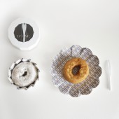
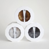
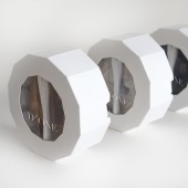
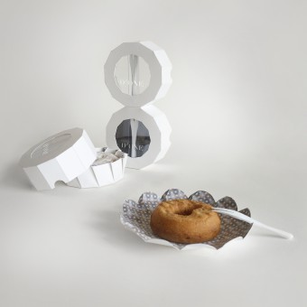
| DESIGN NAME: D One PRIMARY FUNCTION: Packaging INSPIRATION: D One was created to introduce a new way to appreciate donut. The packaging design for donut have been coming from a box of six or more, or with a snack bag. The downside is that the flavor usually jam together, for example frost went on to another donut or powder went all over inside the box. To find a solution, My inspiration was to design a packaging that contains one donut at a time, avoiding flavor mixed and easy to grab-and-go. UNIQUE PROPERTIES / PROJECT DESCRIPTION: D One is a small but exquisite packaging design for donut. The concept is to enhance the experience of eating donut. The design is a clean and modern. D One packaging includes a fork, a donut, and a plate. The bottom carton not only serves a container for the donut, but also can be transformed into a beautiful plate when its unfold. It brings surprising experience when people open the packaging. The dodecagon shape avoids the packaging from rolling around, and is easy to stack on a shelf too! OPERATION / FLOW / INTERACTION: When the bottom carton is unfold, it functions as a beautiful plate as well as a container to hold donut. D One packaging includes a fork, a plate, and a donut. These three elements interact with people: from attracted by the packaging, to opening the packaging, and to enjoying donut. The flow is a full experience and one of a kind. PROJECT DURATION AND LOCATION: The project was completed in December 2016, New York City. FITS BEST INTO CATEGORY: Packaging Design |
PRODUCTION / REALIZATION TECHNOLOGY: The carton is made of 100 lb recycled Bristol paper. When the packaging is produced on paper mill, the dodecagon-shaped dieline can be pieced closely like a big modular shape. It leaves little space for wast of paper. SPECIFICATIONS / TECHNICAL PROPERTIES: width 4inch X depth 4inch X height 1.6inch TAGS: donut, packaging design, dodecagon shape, eco-friendly, grab-and-go, fork, plate RESEARCH ABSTRACT: According to statistic based on US Census and NHCS in 2016, 10 billion donuts are made a year in the USA, which is about 30 per person a year. Another data based on QuickBite magazine in the UK states that grab-and-go sector performing is still growing, and it reaches a growth rate of 5 percent in 2015. Because so many people are enjoying donut and grab-and-go is a trend, I had designed one donut per packaging. I also wanted to introduce a new way to eat donut and enhance the experience. CHALLENGE: I want to create a modern and clean packaging design that focus more on the product, yet unique so it can differentiate what is already in the market. The challenge is to meet packaging functionality to contain product, its eco-friendliness on material, it’s grab-and-go convenience, and its aesthetic aspect. Keeping the objectives in mind, I created fun and stackable packaging with dodecagon shape, in addition to using recycled paper and saving space for dieline. The challenge lead me to surprising result. ADDED DATE: 2017-02-02 04:12:50 TEAM MEMBERS (1) : Jiaru Lin IMAGE CREDITS: Designer: Jiaru Lin, Photographer: Andrea Malizia |
||||
| Visit the following page to learn more: http://www.jiarulin.com | |||||
| AWARD DETAILS | |
 |
D One Packaging by Jia-Ru Lin is Winner in Packaging Design Category, 2016 - 2017.· Read the interview with designer Jia-Ru Lin for design D One here.· Press Members: Login or Register to request an exclusive interview with Jia-Ru Lin. · Click here to register inorder to view the profile and other works by Jia-Ru Lin. |
| SOCIAL |
| + Add to Likes / Favorites | Send to My Email | Comment | Testimonials | View Press-Release | Press Kit | Translations |
Did you like Jia-Ru Lin's Packaging Design?
You will most likely enjoy other award winning packaging design as well.
Click here to view more Award Winning Packaging Design.


