Galena Pharm Inc Corporate Identity by Radiant Creatives |
Home > Winners > #52987 |
 |
|
||||
| DESIGN DETAILS | |||||
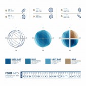
| DESIGN NAME: Galena Pharm Inc PRIMARY FUNCTION: Corporate Identity INSPIRATION: Our foremost inspiration was the quote by philosopher Jan Smuts: "Everywhere we look in nature, we see nothing but wholes. Not just simple wholes, but hierarchical ones: each whole is a part of a larger whole which is itself a part of a larger whole. Fields within fields within fields, stretching through the cosmos, interlacing each and everything with each and every other." We were very interested in creating a depiction of a "unified and organic whole" created from seemingly complex components. UNIQUE PROPERTIES / PROJECT DESCRIPTION: The unique visual properties of Galena's trademark and visual design come from the principle of "order among seeming chaos"; a fact that runs through all existence. Our aim was to create a design that represents Galena Pharmaceutical' OPERATION / FLOW / INTERACTION: All final graphical designs are custom-built vector graphics, ready for use for all purposes from digital to print. Visual guidelines are presented in text format for the client. These guidelines help the client better understand the philosophy behind the design and colors as well as make better decisions when using these assets in the brand's marketing campaigns and social media interactions. PROJECT DURATION AND LOCATION: Project start was in Dec. 2016 and was fully finalized in Feb. 2017. FITS BEST INTO CATEGORY: Graphics, Illustration and Visual Communication Design |
PRODUCTION / REALIZATION TECHNOLOGY: Sketches on paper, Corel Draw X7, Adobe Photoshop, Adobe Illustrator SPECIFICATIONS / TECHNICAL PROPERTIES: Logo design and theme are vector based graphics, all other assets are mockup designs created from photographs edited inside Adobe Photoshop. Created on a PC system. Visual identity guidelines for the brand were designed as a PDF document/presentatio TAGS: Logo, Visual identity, graphic design, medicine, brand identity, trademark, Canada, Vancouver RESEARCH ABSTRACT: The Radiant Creatives design team conducted constant brainstorming sessions in order to figure out the best visual approach for representing Galena Pharmaceuticals; a brand primarily based in Vancouver, Canada. Aside from envisioning the logo to have a medical feel to it, we wanted to add a more deliberate sense of purpose by creating a more complex aesthetic that resembles "biological architecture". CHALLENGE: Looking back, our biggest challenge was that we wanted to create a more abstract representation of the client's medical activities. However, after research on similar medical brands, we found that the more literal visual approach is preferred in their visual identities. Of course, after consulting with the client on the logo design, they were firmly sure that it does indeed fit the job very well. ADDED DATE: 2017-01-30 15:28:01 TEAM MEMBERS (3) : Mohsen Beygzadeh, Hamed Taleghani and Navid Kosari Fard IMAGE CREDITS: Radiant Creatives, 2016. PATENTS/COPYRIGHTS: All Rights Reserved (c) 2017 Radiant Creatives & Galena Pharm Inc. |
||||
| Visit the following page to learn more: http://www.galenapharm.com | |||||
| AWARD DETAILS | |
 |
Galena Pharm Inc Corporate Identity by Radiant Creatives is Winner in Graphics, Illustration and Visual Communication Design Category, 2016 - 2017.· Read the interview with designer Radiant Creatives for design Galena Pharm Inc here.· Press Members: Login or Register to request an exclusive interview with Radiant Creatives. · Click here to register inorder to view the profile and other works by Radiant Creatives. |
| SOCIAL |
| + Add to Likes / Favorites | Send to My Email | Comment | Testimonials | View Press-Release | Press Kit |
Did you like Radiant Creatives' Graphic Design?
You will most likely enjoy other award winning graphic design as well.
Click here to view more Award Winning Graphic Design.


