DESIGN NAME: Nissan NOTE
PRIMARY FUNCTION: Brochure
INSPIRATION: ・Extra modification is not needed to show Nissan’s confidence in the products.
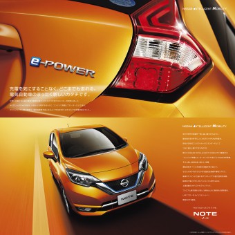
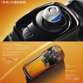
・To give strong impact, had an idea to include full scale of NOTE e-POWER.
・Obviously it is impossible to have full scale of the car as Nissan brochures are standardized in the size of 250mm x 250mm.
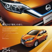
・Cut out parts characterizing NOTE e-POWER and used in the brochure nearly as big as actual size.
UNIQUE PROPERTIES / PROJECT DESCRIPTION: ・ A new performance called e-POWER is added to Nissan NOTE.
・e-POWER means a new form of electronic vehicle. Generate electric power in the engine, instead of charging externally and use only the motor to run. Possible to drive as far as one can without worrying about charging just like gasoline-fueled automobile.
・This brochure is created to communicate a message of how NOTE is innovative and advanced with this inventive technology equipped.
OPERATION / FLOW / INTERACTION: ・In Japan, automobile brochures are considered as an incentive item for targeted customers. Therefore, a brochure must convey both emotional and functional qualities to the potential buyer.
・In general, there are two ways of obtaining a brochure: either by picking it up at a dealership, or by ordering it on the Internet.
・In Japan, even after purchasing a car the delivery period can stretch to three months. The brochure allows the new owner to obsess over his or her purchase and fantasize about driving it, while waiting for the car to be delivered.
PROJECT DURATION AND LOCATION: ・The NISSAN NOTE was launched in November 2016 Japan. The brochure was released at the same time and will be used until the model gets updated.
FITS BEST INTO CATEGORY: Graphics, Illustration and Visual Communication Design
|
PRODUCTION / REALIZATION TECHNOLOGY: ・One-side foldout pagination is used for three times consecutively. When the page showing a part of vehicle in nearly full scale is turned, NOTE e-POWER main style appears and advanced technology stories are unfolded.
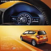
・All of vehicle body and interior images are created by 3DCG and the beauty and high-quality feeling of the car are perfectly reproduced by using background reflections and glare effectively
SPECIFICATIONS / TECHNICAL PROPERTIES: ・Size: a 250-mm square with 58 pages. Saddle stich.
・This brochure uses “FSC (Forest Stewardship Council) approved paper”, which is made from thinned wood.
TAGS: E-graphics communications
RESEARCH ABSTRACT: None
CHALLENGE: ・NOTE e-POWER is a car overturning a traditional mindset. If that is the case, the brochure should be something overturning a traditional mindset as well.
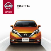
・Generally a car brochure has introductory pages when the cover page is turned, followed by a few styling pages.
・However this brochure is created to give a strong impact to people looking at it by using the vehicle’s parts (nearly full scale) in consecutive pagination and using a key color of orange.
・In addition to this visual impact, created simple headlines showing e-POWER’s originality to stimulate people’s curiosity. Font size is 50 points and this symbolizes Nissan’s confidence in this car.
・All of vehicle body and interior images are created by 3DCG, but they have perfect quality and are nearly indistinguishable with the real ones
ADDED DATE: 2017-01-25 04:39:38
TEAM MEMBERS (1) : Executive Creative Director: Tomohira Kodama, Creative Director: Yoshihiro Mimura, Art direction/ Copywriting: LIBERO Creative and 3DCG: EGC D-PT/CG Creative
IMAGE CREDITS: All image: Photographer: BA2, 3DCG: EGC D-PT/CG Creative
|