Danh Hien Jewelers Corporate Identity by Bratus Agency |
Home > Winners > #52751 |
 |
|
||||
| DESIGN DETAILS | |||||
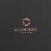
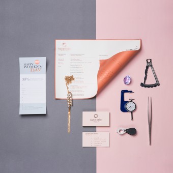
| DESIGN NAME: Danh Hien Jewelers PRIMARY FUNCTION: Corporate Identity INSPIRATION: We exploit the inspiration from the structure and the block image of precious stones, diamond, the bond of chemical components under the guarantee of tidiness and elegance. We would like to create a pattern structure may be flexibly applied in different angles. UNIQUE PROPERTIES / PROJECT DESCRIPTION: Danh Hien Jewelers is company specializes in handmade diamond jewelry, working as a family tradition. They still produce handcrafted jewelry in a traditional way. Their diamond products are all made under the standard of GIA. The project started with great sense of handcraft, elegance and fineness which help Bratus in decision of design vision, material choice and production. OPERATION / FLOW / INTERACTION: Our direction for approach is the combination of the main letters in the brand name, the top view image of the diamond, the Celtic art to make the geometric signature. We chose serif typeface as it represented for aesthetics and fashion industry. The color palette is selected to show the charm, the femininity. The supplementary colors have been carefully chose to go harmonious for flexibility usage. PROJECT DURATION AND LOCATION: Project started in October 2014 and ended by January 2015. The stationery was officially used by Danh Hien as the company's new identity from the beginning of 2015. FITS BEST INTO CATEGORY: Graphics, Illustration and Visual Communication Design |
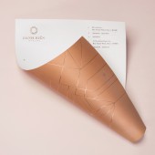
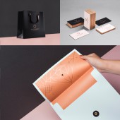
PRODUCTION / REALIZATION TECHNOLOGY: Mood board, Sketches, Adobe Illustrator,Adobe Photoshop SPECIFICATIONS / TECHNICAL PROPERTIES: Our publication are made with special handcrafted printing treatment combine on plain-colored paper materials. The identity set including name card, letterhead, envelope, guarantee paper, marketing collateral are handmade with special techniques such as handcraft, edge printing and bronze foil embossing. TAGS: Logo, visual identity, jewelry, branding, vietnam, bratus agency RESEARCH ABSTRACT: Bratus was tasked to develop a new logo and brand identity to stand out and show the aspects of luxury and modernity as well as tradition, the uniqueness, and their attention to each details. CHALLENGE: We take the main inspiration from the diamond. The image of a diamond is rather popular in jewelry brands. Therefore, the biggest challenge that we have to face is making an exceptionally creative and unique brand mark. ADDED DATE: 2017-01-19 15:38:14 TEAM MEMBERS (1) : Creative Director/Designer: Jimmi Tuan, Graphic Designer: Au Ta, Account Manager: Hien Nguyen IMAGE CREDITS: Photography: Eric Huynh |
||||
| Visit the following page to learn more: https://www.behance.net/gallery/22899441 |
|||||
| AWARD DETAILS | |
 |
Danh Hien Jewelers Corporate Identity by Bratus Agency is Winner in Graphics, Illustration and Visual Communication Design Category, 2016 - 2017.· Read the interview with designer Bratus Agency for design Danh Hien Jewelers here.· Press Members: Login or Register to request an exclusive interview with Bratus Agency. · Click here to register inorder to view the profile and other works by Bratus Agency. |
| SOCIAL |
| + Add to Likes / Favorites | Send to My Email | Comment | Testimonials | View Press-Release | Press Kit |
Did you like Bratus Agency's Graphic Design?
You will most likely enjoy other award winning graphic design as well.
Click here to view more Award Winning Graphic Design.


