Kai Garden Logo and VI by Dongdao Creative Branding Group |
Home > Winners > #52594 |
 |
|
||||
| DESIGN DETAILS | |||||
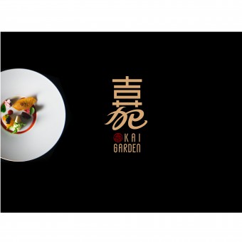
| DESIGN NAME: Kai Garden PRIMARY FUNCTION: Logo and VI INSPIRATION: Cantonese dishes have opulent meanings and absorbs Western cuisines features. We tried to present a combination of modernity and tradition as well as an infusion of the East and the West. By summarizing the common features of Chinese characters 嘉 and 苑, we utilized isomorphic form to transit from up to down. Such form is the optimal expression in communicating infusion. To reflect Cantonese dining culture features, we referred to Chinese calliggraphy in creating 苑(yuàn). UNIQUE PROPERTIES / PROJECT DESCRIPTION: Kai Garden is a new modern restaurant mainly serving Cantonese dishes matched with Western food, originally set up in mall area of Singapore. It focuses on ethnic Chinese white-collar employees. OPERATION / FLOW / INTERACTION: As the cuisine which is most innovative and diversified, Cantonese dishes have opulent meanings and absorbs characteristics of Western cuisines. In the logo design, we tried to present a combination of modernity and tradition as well as an infusion of the East and the West. Having experienced series of auditing and analyzing, we concluded that graphic font can be well up to this effect besides conveying powerful cultural meaning. PROJECT DURATION AND LOCATION: The project started in September 2015 in Beijing and finished in November 2015 in Beijing. FITS BEST INTO CATEGORY: Graphics, Illustration and Visual Communication Design |
PRODUCTION / REALIZATION TECHNOLOGY: By summarizing the common features of Chinese characters 嘉(jiā) and 苑(yuàn), we utilized isomorphic form to transit from up to down. And, such form is just the optimal expression in communicating infusion. In order to reflect the unpredictable and inclusive characteristics of Cantonese dining culture, we referred to Chinese calligraphy in creating苑(yuàn), thus to show the core concept of the logo to the public. The antique logo symbolizes status and taste, while encompassing profound Chinese cultural characteristics. SPECIFICATIONS / TECHNICAL PROPERTIES: - TAGS: VI, Cuisine, Feature, Infusion, Dish RESEARCH ABSTRACT: Considering features of Cantonese dining culture, we tried to present a combination of modernity and tradition as well as an infusion of the East and the West in the logo design. By summarizing the common features of Chinese characters 嘉(jiā) and 苑(yuàn), we utilized isomorphic form to transit from up to down. And, such form is just the optimal expression in communicating infusion. In order to reflect the unpredictable and inclusive characteristics of Cantonese dining culture, we referred to Chinese calligraphy in creating苑(yuàn), thus to show the core concept of the logo to the public. The antique logo symbolizes status and taste, while encompassing profound Chinese cultural characteristics. CHALLENGE: It is difficult for us to convey a combination of modernity and tradition as well as an infusion of the East and the West in the logo design for such brand comprising features of both oriental and occidental cultures. Having experienced series of auditing and analyzing, we finally concluded that graphic font can be well up to this effect besides conveying powerful cultural meaning. ADDED DATE: 2017-01-12 03:48:26 TEAM MEMBERS (1) : Dongdao Design Team IMAGE CREDITS: Dongdao Creative Branding Group, 2016. |
||||
| Visit the following page to learn more: http://www.dongdao.net/ | |||||
| AWARD DETAILS | |
 |
Kai Garden Logo and Vi by Dongdao Creative Branding Group is Winner in Graphics, Illustration and Visual Communication Design Category, 2016 - 2017.· Read the interview with designer Dongdao Creative Branding Group for design Kai Garden here.· Press Members: Login or Register to request an exclusive interview with Dongdao Creative Branding Group. · Click here to register inorder to view the profile and other works by Dongdao Creative Branding Group. |
| SOCIAL |
| + Add to Likes / Favorites | Send to My Email | Comment | Testimonials | View Press-Release | Press Kit |
Did you like Dongdao Creative Branding Group's Graphic Design?
You will most likely enjoy other award winning graphic design as well.
Click here to view more Award Winning Graphic Design.


