Tangtangwu Logo and VI by Dongdao Creative Branding Group |
Home > Winners > #52593 |
 |
|
||||
| DESIGN DETAILS | |||||
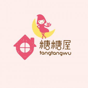
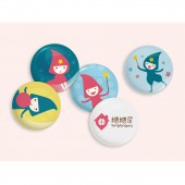
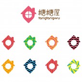
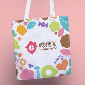
| DESIGN NAME: Tangtangwu PRIMARY FUNCTION: Logo and VI INSPIRATION: ‘wu’ means delicious food home while ‘tang’ stresses sweet taste feeling. It conveys the concept to store up global foods. So the logo shall reflect the fine mood in enjoying snacks, also needing to attract the attention of male consumers. We combined graphics with ‘tangtangwu’ thus to facilitate the convenient recognition and communication. The graphical presentation of 'wu' impresses people with the joy of tasting. Rounded lines and warm colors are quite aesthetic and easy to communicate. UNIQUE PROPERTIES / PROJECT DESCRIPTION: Founded in 2006, Tangtangwu now develops into a reputable brand from a small online shop dealing in imported foods. With continuous and rapid development, it’s really the time for Tangtangwu to enhance its recognition and improve its quality so as to establish an exclusive brand image. Tangtangwu is actually an entity dealing in all varying delicious foods, not only candies. OPERATION / FLOW / INTERACTION: We also provided a mascot design. The image of a little faerie is full of loveliness, smartness and joy. She can show a variety of yummy foods with the magic wand. Together with the logo, the mascot image perfectly displays the happy mood because of simplicity and joy in tasting. PROJECT DURATION AND LOCATION: The project started in June 2015 in Shanghai and finished in August 2015 in Shanghai. FITS BEST INTO CATEGORY: Graphics, Illustration and Visual Communication Design |
PRODUCTION / REALIZATION TECHNOLOGY: Tangtangwu is actually an entity dealing in all varying delicious foods, not only candies. Herein, ‘wu’ means the home of delicious foods while ‘tang’ emphasizes the sweet feeling in tasting. It conveys the concept to store up all global foods in the world. Therefore, the logo shall be capable of reflecting the fine mood in enjoying snacks, avoiding the misconception of selling candies. Besides, the logo also needs to attract the attention of male consumers so as to expand the market coverage of Tangtangwu. SPECIFICATIONS / TECHNICAL PROPERTIES: - TAGS: VI, Food, Mood, Tasting RESEARCH ABSTRACT: In the creation, we combined graphics with the name ‘tangtangwu’ thus to facilitate the convenient recognition and communication. The graphical presentation of ‘wu’ impresses people with the joy of tasting. Rounded lines and warm colors are quite aesthetic and easy to communicate. CHALLENGE: Since tangtangwu is actually an entity dealing in all varying delicious foods, not only candies. So it's a challenge for us in the logo design concerning how to avoid the misconception of selling candies. Thus in the creation, we combined graphics with the name ‘tangtangwu’ thus to facilitate the convenient recognition and communication. The graphical presentation of ‘wu’ impresses people with the joy of tasting. Rounded lines and warm colors are quite aesthetic and easy to communicate. ADDED DATE: 2017-01-12 02:56:45 TEAM MEMBERS (1) : Dongdao Design Team IMAGE CREDITS: Dongdao Creative Branding Group, 2016. |
||||
| Visit the following page to learn more: http://www.dongdao.net/ | |||||
| AWARD DETAILS | |
 |
Tangtangwu Logo and Vi by Dongdao Creative Branding Group is Winner in Graphics, Illustration and Visual Communication Design Category, 2016 - 2017.· Read the interview with designer Dongdao Creative Branding Group for design Tangtangwu here.· Press Members: Login or Register to request an exclusive interview with Dongdao Creative Branding Group. · Click here to register inorder to view the profile and other works by Dongdao Creative Branding Group. |
| SOCIAL |
| + Add to Likes / Favorites | Send to My Email | Comment | Testimonials | View Press-Release | Press Kit |
Did you like Dongdao Creative Branding Group's Graphic Design?
You will most likely enjoy other award winning graphic design as well.
Click here to view more Award Winning Graphic Design.


