Dong Lai Shun Logo and VI by Dongdao Creative Branding Group |
Home > Winners > #52366 |
 |
|
||||
| DESIGN DETAILS | |||||
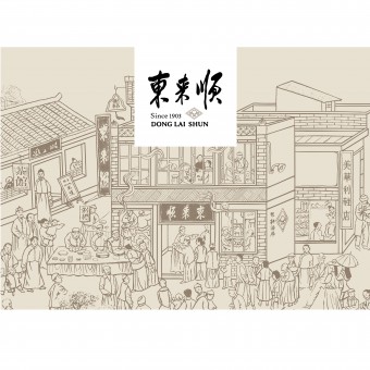
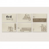
| DESIGN NAME: Dong Lai Shun PRIMARY FUNCTION: Logo and VI INSPIRATION: In order to enhance its brand image, we restored the scene, people and story of Donglaishun at its founding time. Based on research, we adopted Beijing-style hand-drawn illustrations in design, which represented the prosperity, ancient buildings, the general public, officials and nobles, poets and literary men all at that time. Therefore, consumers can perceive the historical inheritance of cultural value behind this revitalized brand. UNIQUE PROPERTIES / PROJECT DESCRIPTION: Donglaishun, with its origin in 1903, is a hundred-year franchise restaurant. As a China time-honored brand, it is quite public among the public due to its authority and high quality. However, its brand value weakened continuously, causing misconception for consumers to recognize it. By structuring both its historical and cultural context, we represented the restaurant like 100 years ago, adopting hand-drawn illustrations as core brand elements. OPERATION / FLOW / INTERACTION: By applying all the core elements (hand-drawn illustrations), we constructed the systematic brand identity, and created an artistic and humanistic brand image. Therefore, consumers can perceive the historical inheritance of cultural value behind this revitalized brand. PROJECT DURATION AND LOCATION: The project started in August 2015 in Beijing and finished in November 2015 in Beijing. FITS BEST INTO CATEGORY: Graphics, Illustration and Visual Communication Design |
PRODUCTION / REALIZATION TECHNOLOGY: By structuring both its historical and cultural context for Donglaishun, we represented the restaurant like 100 years ago, adopting hand-drawn illustrations as core brand elements. We restructure the brand system for Donglaishun by adjusting the brand identity and the brand logo, standardizing the color system, selecting proper auxiliary decoration patterns and pictures, as well as unifying the exclusive font so as to upgrade the brand image. SPECIFICATIONS / TECHNICAL PROPERTIES: - TAGS: VI, China, Brand Image, Illustrations RESEARCH ABSTRACT: Based on research, we adopted Beijing-style hand-drawn illustrations in design, which represented the prosperity, ancient buildings, the general public, officials and nobles, poets and literary men all at that time. By applying all the above core elements, we constructed the systematic brand identity, and created an artistic and humanistic brand image. We restructure the brand system for Donglaishun by adjusting the brand identity and the brand logo, standardizing the color system, selecting proper auxiliary decoration patterns and pictures, as well as unifying the exclusive font so as to upgrade the brand image. CHALLENGE: Since Donglaishun is a China time-honored brand, it is very important for us to perceive the historical inheritance of cultural value behind this revitalized brand. It's also a challenge for us considering how to unify the brand concept throughout such a long time. Therefore, through constant and immense research, we adopted Beijing-style hand-drawn illustrations in design, which represented the prosperity, ancient buildings, the general public, officials and nobles, poets and literary men all at that time. ADDED DATE: 2016-12-29 08:28:39 TEAM MEMBERS (1) : Dongdao Design Team IMAGE CREDITS: Dongdao Creative Branding Group, 2016. |
||||
| Visit the following page to learn more: http://www.dongdao.net/ | |||||
| AWARD DETAILS | |
 |
Dong Lai Shun Logo and Vi by Dongdao Creative Branding Group is Winner in Graphics, Illustration and Visual Communication Design Category, 2016 - 2017.· Read the interview with designer Dongdao Creative Branding Group for design Dong Lai Shun here.· Press Members: Login or Register to request an exclusive interview with Dongdao Creative Branding Group. · Click here to register inorder to view the profile and other works by Dongdao Creative Branding Group. |
| SOCIAL |
| + Add to Likes / Favorites | Send to My Email | Comment | Testimonials | View Press-Release | Press Kit |
Did you like Dongdao Creative Branding Group's Graphic Design?
You will most likely enjoy other award winning graphic design as well.
Click here to view more Award Winning Graphic Design.


