Suning.com Logo and VI by Dongdao Creative Branding Group |
Home > Winners > #52341 |
 |
|
||||
| DESIGN DETAILS | |||||
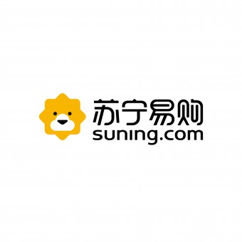
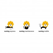
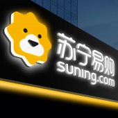
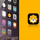
| DESIGN NAME: Suning.com PRIMARY FUNCTION: Logo and VI INSPIRATION: Since it's a competitive e-commerce entity, we adopted the king of all animals - 'the lion' - in our design to highlight the position and the potential of SUNING. We utilized cloud to depict lionet mouth, conveying a lovely visual effect. By combining relevant elements in the pattern, the logo shows a bran-new model of integrated online-to-offline service. Through image variation, we intended to attract more young and personalized consumers to construct an integrative consumption experience. UNIQUE PROPERTIES / PROJECT DESCRIPTION: Suning.com is originally a B2C online shopping platform subordinated to Suning Group and ranks among the top three in the Chinese B2C market. In 2015, Suning Group combined Suning.com with Suning appliance retail store to integrate online-to-offline services and construct a one-stop service platform for customers. OPERATION / FLOW / INTERACTION: In the pattern, we utilized cloud to depict a lionet mouth, conveying a lovely visual effect. By combining all relevant elements in the pattern, the logo shows a brand new model of integrated online-to-offline service. The image variation helps to attract more young and personalized consumers to construct an integrative consumption experience. Besides that, the image of lionet is added, thus making the new logo increasingly modern, fashionable, friendly and approachable.through the former limits. PROJECT DURATION AND LOCATION: The project started in June 2015 in Nanjing and finished in November 2015 in Nanjing. FITS BEST INTO CATEGORY: Graphics, Illustration and Visual Communication Design |
PRODUCTION / REALIZATION TECHNOLOGY: The brand-new logo adopts the combination of black, white and yellow to substitute the former combination of yellow and blue. Besides that, the image of lionet is added, thus making the new logo increasingly modern, fashionable, friendly and approachable. Mixed capital and small letters are also applied in the design to convey a sense of visual balance. SPECIFICATIONS / TECHNICAL PROPERTIES: - TAGS: Logo, VI, E-commerce, Lion RESEARCH ABSTRACT: Considering the Group is a competitive e-commerce entity, we adopted the king of all animals – “the lion” - in our design to highlight the position and the potential of SUNING. In the pattern, we utilized clouds to depict a lionet mouth, conveying a lovely visual effect. By combining all relevant elements in the pattern, the logo shows a brand new model of integrated online-to-offline service. Through the image variation, we intended to attract more young and personalized consumers to construct an integrative consumption experience. The logo adopts the combination of black, white and yellow to substitute the former combination of yellow and blue. Besides that, the image of lionet is added, thus making the new logo increasingly modern, fashionable, friendly and approachable. Compared with the original logo, the new identity completely breaks through the former limits. CHALLENGE: In the pattern, we utilized clouds to depict a lionet mouth, conveying a lovely visual effect. By combining all relevant elements in the pattern, the logo shows a brand new model of integrated online-to-offline service. Through the image variation, we intended to attract more young and personalized consumers to construct an integrative consumption experience.The brand-new logo we designed for Suning.com adopts the combination of black, white and yellow to substitute the former combination of yellow and blue. Besides that, the image of lionet is added, thus making the new logo increasingly modern, fashionable, friendly and approachable. Compared with the original logo, the new identity completely breaks through the former limits. ADDED DATE: 2016-12-28 08:49:40 TEAM MEMBERS (1) : Dongdao Design Team IMAGE CREDITS: Dongdao Creative Branding Group |
||||
| Visit the following page to learn more: http://www.dongdao.net | |||||
| AWARD DETAILS | |
 |
Suning.com Logo and Vi by Dongdao Creative Branding Group is Winner in Graphics, Illustration and Visual Communication Design Category, 2016 - 2017.· Read the interview with designer Dongdao Creative Branding Group for design Suning.com here.· Press Members: Login or Register to request an exclusive interview with Dongdao Creative Branding Group. · Click here to register inorder to view the profile and other works by Dongdao Creative Branding Group. |
| SOCIAL |
| + Add to Likes / Favorites | Send to My Email | Comment | Testimonials | View Press-Release | Press Kit |
Did you like Dongdao Creative Branding Group's Graphic Design?
You will most likely enjoy other award winning graphic design as well.
Click here to view more Award Winning Graphic Design.


