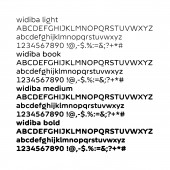
Widiba Institutional Font Corporate identity by Jekyll and Hyde - Fabrizio Schiavi |
Home > Winners > #52086 |
 |
|
||||
| DESIGN DETAILS | |||||
| DESIGN NAME: Widiba Institutional Font PRIMARY FUNCTION: Corporate identity INSPIRATION: We took inspiration for this typeface from the design of the monitor, which has an external rounded corner and an internal squared corner. We also took inspiration from the typefaces realized by Herbert Bayer. UNIQUE PROPERTIES / PROJECT DESCRIPTION: The typeface has a friendly aspect and is enriched with little details that, on purpose, makes it "no ordinary". Moreover, to obtain more flexibility for various applications, we created four different rounded font weights, in addition to a serif version and a condensed one, both of which develops in just one weight. OPERATION / FLOW / INTERACTION: Having a personalized font allows to create a stronger corporate identity. PROJECT DURATION AND LOCATION: The project started in July 2014 in Milano and finished in January 2017. FITS BEST INTO CATEGORY: Graphics, Illustration and Visual Communication Design |
PRODUCTION / REALIZATION TECHNOLOGY: The typeface has been initially designed on paper, then we used FontLab Studio program, a industry-standard font creation and editing tool. SPECIFICATIONS / TECHNICAL PROPERTIES: The typeface has been realized in OpenType PS and TrueType/OpenType TT format. TAGS: type, typeface, type design, typography, brand identity RESEARCH ABSTRACT: We analyzed many existing Rounded Font to find distinctive elements useful to create our font. We took inspiration also from the first typefaces realized during the Bauhaus movement by Herbert Bayer. CHALLENGE: The hardest part of this design activity has been keeping both a good legibility and a good aesthetic result. ADDED DATE: 2016-12-10 14:57:26 TEAM MEMBERS (3) : Creative Director: Marco Molteni, Creative Director: Margherita Monguzzi and Type Designer: Fabrizio Schiavi Design IMAGE CREDITS: Jekyll and Hyde - Fabrizio Schiavi, 2016. PATENTS/COPYRIGHTS: Copyrights belong to Widiba S.p.A., 2015. |
||||
| Visit the following page to learn more: http://www.jeh.it/widiba/ | |||||
| AWARD DETAILS | |
 |
Widiba Institutional Font Corporate Identity by Jekyll and Hyde-Fabrizio Schiavi is Winner in Graphics, Illustration and Visual Communication Design Category, 2016 - 2017.· Read the interview with designer Jekyll and Hyde - Fabrizio Schiavi for design Widiba Institutional Font here.· Press Members: Login or Register to request an exclusive interview with Jekyll and Hyde - Fabrizio Schiavi. · Click here to register inorder to view the profile and other works by Jekyll and Hyde - Fabrizio Schiavi. |
| SOCIAL |
| + Add to Likes / Favorites | Send to My Email | Comment | Testimonials | View Press-Release | Press Kit |
Did you like Jekyll and Hyde-Fabrizio Schiavi's Graphic Design?
You will most likely enjoy other award winning graphic design as well.
Click here to view more Award Winning Graphic Design.


