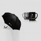
Duobaan Hotel Logo and VI by Dongdao Design Team |
Home > Winners > #52002 |
| CLIENT/STUDIO/BRAND DETAILS | |
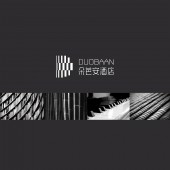 |
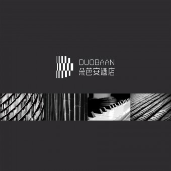
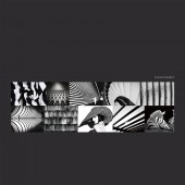
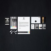
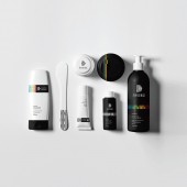
NAME: Duobaan Hotel PROFILE: Duobaan is phonetically close to dopamine in Chinese pronunciation. We tried to build a brand image constructing the atmosphere similar to the feeling conveyed by dopamine, a neurotransmitter that helps control the brain's reward and pleasure centers. Dopamine also helps regulate movement and emotional responses, and it enables us not only to see rewards, but to take action to move toward them. We took simple color blocks as fundamental elements. By way of composition method, we regularly arranged these color blocks into the form of D which serves as the initial of both Duobaan and Design. |
| AWARD DETAILS | |
 |
Duobaan Hotel Logo and Vi by Dongdao Design Team is Winner in Graphics, Illustration and Visual Communication Design Category, 2016 - 2017.· Read the interview with designer Dongdao Design Team for design Duobaan Hotel here.· Press Members: Login or Register to request an exclusive interview with Dongdao Design Team. · Click here to register inorder to view the profile and other works by Dongdao Design Team. |
| SOCIAL |
| + Add to Likes / Favorites | Send to My Email | Comment | Testimonials | View Press-Release | Press Kit |
Did you like Dongdao Design Team's Graphic Design?
You will most likely enjoy other award winning graphic design as well.
Click here to view more Award Winning Graphic Design.


