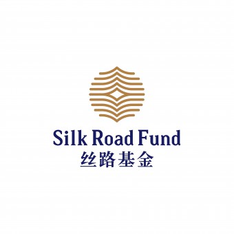
Silk Road Fund Logo and VI by Dongdao Creative Branding Group |
Home > Winners > #51983 |
 |
|
||||
| DESIGN DETAILS | |||||
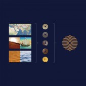
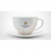
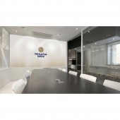
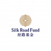
| DESIGN NAME: Silk Road Fund PRIMARY FUNCTION: Logo and VI INSPIRATION: The Silk Road adresses both the land and maritime Silk road. We tried to absorb the very quintessence from the two roads. From the ancient capital of Chang'an to Rome, the Silk Road is devided by countless desserts. From Quanzhou to Red Sea, the route is distant by wave and tide. By absorbing the characteristics from both land and maritime Silk Road, we adopted the visual symbols applicable to both desert and wave. UNIQUE PROPERTIES / PROJECT DESCRIPTION: Silk Road Fund is part of the 'The Belt and Road Initiative' proposed by the People’s Republic of China. The outline of the logo is round, with a square shape inside: this resonates well with the traditional Chinese belief: 'Earth as square, heaven as round'. OPERATION / FLOW / INTERACTION: Following a philosophy of openness, inclusiveness and mutual benefit, the Silk Road Fund mainly provides funding and financing support for trade and economic cooperation and connectivity. By absorbing the characteristics from both land and maritime Silk Road, we adopted the visual symbols applicable to both desert and ocean. PROJECT DURATION AND LOCATION: The project started in January 2015 in Beijing and finished in August 2015 in Beijing. FITS BEST INTO CATEGORY: Graphics, Illustration and Visual Communication Design |
PRODUCTION / REALIZATION TECHNOLOGY: By absorbing the characteristics from both land and maritime Silk Road, we adopted the visual symbols applicable to both desert and ocean. By connecting these symbols with undulating lines, we created the logo into a shape of an ancient coin to convey the financial features of the Fund. SPECIFICATIONS / TECHNICAL PROPERTIES: silk, (glossy, soft, ductile and with fine texture) composed of fine fibers, we designed such distinguishable and recognizable auxiliary graphics. The connection points between the lines illustrate the common pursuits of all nations involved in this endeavor. Properties of silk are presented throughout: the arrangements, movements, twisting and overlapping lines. TAGS: Logo, VI, Culture, National RESEARCH ABSTRACT: The Silk Road adresses both the land and maritime Silk road. We tried to absorb the very quintessence from the two roads. From the ancient capital of Chang'an to Rome, the Silk Road is devided by countless desserts. From Quanzhou to Red Sea, the route is distant by wave and tide. By absorbing the characteristics from both land and maritime Silk Road, we adopted the visual symbols applicable to both desert and wave. CHALLENGE: Inspired by silk (glossy, soft, ductile and with fine texture) composed of fine fibers, we designed such distinguishable and recognizable auxiliary graphics. The connection points between the lines illustrate the common pursuits of all nations involved in this endeavor. Properties of silk are presented throughout: the arrangements, movements, twisting and overlapping lines. ADDED DATE: 2016-12-05 08:29:15 TEAM MEMBERS (1) : Dongdao Design Team IMAGE CREDITS: Dongdao Creative Branding Group, 2016. |
||||
| Visit the following page to learn more: http://www.dongdao.net | |||||
| AWARD DETAILS | |
 |
Silk Road Fund Logo and Vi by Dongdao Creative Branding Group is Winner in Graphics, Illustration and Visual Communication Design Category, 2016 - 2017.· Read the interview with designer Dongdao Creative Branding Group for design Silk Road Fund here.· Press Members: Login or Register to request an exclusive interview with Dongdao Creative Branding Group. · Click here to register inorder to view the profile and other works by Dongdao Creative Branding Group. |
| SOCIAL |
| + Add to Likes / Favorites | Send to My Email | Comment | Testimonials | View Press-Release | Press Kit |
Did you like Dongdao Creative Branding Group's Graphic Design?
You will most likely enjoy other award winning graphic design as well.
Click here to view more Award Winning Graphic Design.


