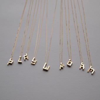
Alphabet Block Chatter Pendant by Yoko Kakuchi |
Home > Winners > #51326 |
 |
|
||||
| DESIGN DETAILS | |||||
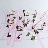
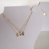
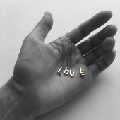
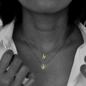
| DESIGN NAME: Alphabet Block Chatter PRIMARY FUNCTION: Pendant INSPIRATION: The uniqueness of this product comes from transforming the letters of the alphabet into something more vibrant and colorful, which is very rare to find in accessories with alphabetical charms. UNIQUE PROPERTIES / PROJECT DESCRIPTION: Uniqueness of this product comes from transforming literal alphabets into something more vibrant and colorful ones, which is very rare to find in accessories with alphabetical charms. OPERATION / FLOW / INTERACTION: Typically, people wear alphabetical jewelry because it means something special such as their initials. As a jewelry designer focusing on “playing with form”, I wanted to create an alphabet set which people feel like wearing because of its form. When we grow, we attach specific meaning to various letters which represent part of our lives. I wanted to add another dimension through A.B.C (Alphabet Block Chatter) as alphabetical form itself has special charm, which can be traced back as long ago as 2nd millennium BC, and I wanted to update its attractiveness to fit with our current life in the digital age. PROJECT DURATION AND LOCATION: I am currently running my own brand MOMOKAMEI at Tokyo. These pendants are designed and created under my second collection theme of “digital and symbols”, which started in December 2015 and finished in February 2016. |
PRODUCTION / REALIZATION TECHNOLOGY: Each charm has been designed with CAD software, Rhinoceros 5.0. Then Solidscape Max2 was used to manufacture the wax patterns. The pendants are available in 10* and 18 karat yellow gold. (*10 Karat gold with green gold plating) SPECIFICATIONS / TECHNICAL PROPERTIES: Dimensions of each pendant based on Width: <I> Width(Min) 2.8 x Depth 6.5x Height 2.6 mm <M>Width(Max)6 TAGS: Alphabet, Lego Block, CAD, pendant, 3D printed Jewelry, rhinoceros, twins, momokamei, play with form RESEARCH ABSTRACT: I did various research for this product. Understanding the origin of alphabet as well as looking up various fonts were conducted at the initial stage of my design. I did this so as to deepen my design concept and its meanings. Method-wise, research was done using the internet, graphic design books as well as through my own experiences and observations of my twin daughters, which added indispensable flavor to the design. CHALLENGE: The major challenge in creating A.B.C (Alphabet Block Chatter) was to transform 2D literal letters of the alphabet into 3D characters with vibrant and colorful properties. ADDED DATE: 2016-10-23 06:53:13 TEAM MEMBERS (1) : Tadashi Kakuchi IMAGE CREDITS: Image#1,#2,#3, and #4: Yoko Kakuchi 2016 Image#5: Tadashi Kakuchi 2016 |
||||
| Visit the following page to learn more: http://momokamei.com | |||||
| AWARD DETAILS | |
 |
Alphabet Block Chatter Pendant by Yoko Kakuchi is Winner in Jewelry Design Category, 2016 - 2017.· Read the interview with designer Yoko Kakuchi for design Alphabet Block Chatter here.· Press Members: Login or Register to request an exclusive interview with Yoko Kakuchi. · Click here to register inorder to view the profile and other works by Yoko Kakuchi. |
| SOCIAL |
| + Add to Likes / Favorites | Send to My Email | Comment | Testimonials | View Press-Release | Press Kit |
Did you like Yoko Kakuchi's Jewelry Design?
You will most likely enjoy other award winning jewelry design as well.
Click here to view more Award Winning Jewelry Design.


