AO FISH MARKET Corporate Identity by JungWon Audrey Choe |
Home > Winners > #51117 |
 |
|
||||
| DESIGN DETAILS | |||||
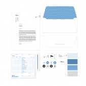
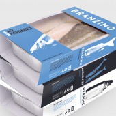
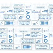
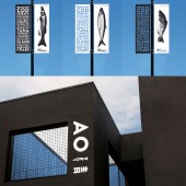
| DESIGN NAME: AO FISH MARKET PRIMARY FUNCTION: Corporate Identity INSPIRATION: The unique look and feel of this brand is inspired by Japanese traditional illustration style. They have very bold primary color palettes and geometric elements in their painting. I'd like to bring the atmosphere and characteristics into this new brand by exploring the treatment of image and colors in a contemporary way at the same time. UNIQUE PROPERTIES / PROJECT DESCRIPTION: Creating a new Brand Identity called as "AO Fish Market" which embodies the spirit that drives into the atmosphere of traditional and artisanal Japanese style with trustworthy quality of fish, seafood and service. The brand name "AO" is come from the pronunciation of this character meaning "blue" in Japanese language. OPERATION / FLOW / INTERACTION: Within the decided art directions, I explored the brand's identity in different format as many as possible. From the print ads on the road to Interactive app for customer, It opens how the clients succeed accessible brand quality throughout this brand. PROJECT DURATION AND LOCATION: The project started in December 2015 and finished February 2016/ in New York City. FITS BEST INTO CATEGORY: Graphics, Illustration and Visual Communication Design |
PRODUCTION / REALIZATION TECHNOLOGY: As a process of creation, what I did as the first step was "sketch". I researched on Japanese characters and came up with some geometric principles which I used for logo system. Then, with Adobe tools such as Illustrator and photoshop, I made e a full set of new typefaces, packages and exterior environmental imagery. SPECIFICATIONS / TECHNICAL PROPERTIES: This whole corporate identity projects include a wide range of executions, such as packaging materials, signage, brochure, and exterior elements. Package material is made with cotton paper and has diverse specifications for each. TAGS: branding, packaging, external design, logo RESEARCH ABSTRACT: The aim of this project is to produce a contemporary fish&seafood market which makes customers' standard expectation higher to the entire shopping process. The first thing I researched is what could be ideal and satisfying journey when people go shopping some seafood. Creating anti-odor and well-treated service and environment of the fish market is the most important idea of this whole project. CHALLENGE: The challenge of this project was making a decision for reality and ideal design quality. This is non-client project but still it has to hold some economic limits by myself. ADDED DATE: 2016-10-06 21:04:09 TEAM MEMBERS (1) : Audrey JungWon Choe IMAGE CREDITS: JungWon Audrey Choe, 2016. PATENTS/COPYRIGHTS: Copyrights belong to JungWon Audrey Choe, 2016 |
||||
| Visit the following page to learn more: https://www.behance.net/gallery/38442545 |
|||||
| AWARD DETAILS | |
 |
Ao Fish Market Corporate Identity by Jungwon Audrey Choe is Winner in Graphics, Illustration and Visual Communication Design Category, 2016 - 2017.· Read the interview with designer JungWon Audrey Choe for design AO FISH MARKET here.· Press Members: Login or Register to request an exclusive interview with JungWon Audrey Choe. · Click here to register inorder to view the profile and other works by JungWon Audrey Choe. |
| SOCIAL |
| + Add to Likes / Favorites | Send to My Email | Comment | Testimonials | View Press-Release | Press Kit |
Did you like Jungwon Audrey Choe's Graphic Design?
You will most likely enjoy other award winning graphic design as well.
Click here to view more Award Winning Graphic Design.


