Tera Brand Identity System Design by Cynda Media Lab |
Home > Winners > #50995 |
 |
|
||||
| DESIGN DETAILS | |||||
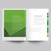
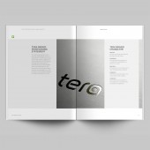
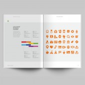
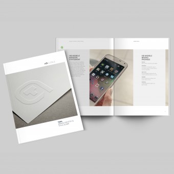
| DESIGN NAME: Tera PRIMARY FUNCTION: Brand Identity System Design INSPIRATION: Tera’s brand system centers around a new typeface, T1, and a colorful array of Life Event Icons, both designed by Cynda Media Lab for HB Mobile. Inspired by the youthful culture of emojis, these icons depict significant moments or things in people's lives. The combination of Tera’s logo mark and the Life Event Icons is a metaphor for the way in which Tera stores people's memories and important files securely in the cloud. UNIQUE PROPERTIES / PROJECT DESCRIPTION: The primary goal of Tera’s identity design is to visually communicate the key consumer benefit: with Tera’s Cloud Memory Extension (CME), your mobile phone will truly become a device capable of recording every adventure in your life, big or small. Tera's flexible identity system reflects the spirit of the brand archetype, the Explorer—somebody who lives life to the fullest by constantly experiencing new things and keeping those memories forever. OPERATION / FLOW / INTERACTION: This brand identity style guide is published digitally in September, 2016, and the brand identity assets as well as the complete guideline is available for download from the Media Kit section of the tera.mobi website. PROJECT DURATION AND LOCATION: This project started in April 2016 in New York and finished in August 2016. This brand identity system design has been invited to exhibit at the Museum at FIT in November 2016. FITS BEST INTO CATEGORY: Graphics, Illustration and Visual Communication Design |
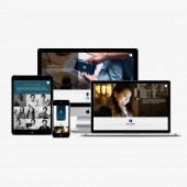
PRODUCTION / REALIZATION TECHNOLOGY: This brand identity system is designed to be applied primarily in the digital environment such as on mobile devices and on websites. The flexible nature of the brand identity is designed to attract multitasking smartphone users who enjoy an active lifestyle. SPECIFICATIONS / TECHNICAL PROPERTIES: This brand identity system style guide is published digitally. TAGS: branding, typography, typface design, visual identity, graphic design, trademark, logo RESEARCH ABSTRACT: A brand identity design research was conducted from April to June, 2016 including stakeholders interviews, competitor analysis, SWOT analysis, and brand archetype analysis. The research findings became the foundation of the brand identity strategy outlined in the style guide. CHALLENGE: The primary challenge of this design project is the fact that the product is software extension of an existing mobile system OS, and the technology itself is too complicated for general consumers to understand. Therefore the brand identity design and strategy focus on the consumer benefits and provided a framework for a lifestyle brand with a special focus on the multitasking and active mobile users. ADDED DATE: 2016-09-30 16:36:43 TEAM MEMBERS (3) : C. J. Yeh, Christie Shin and Fred Pirlot IMAGE CREDITS: Cynda Media Lab, 2016. |
||||
| Visit the following page to learn more: http://cyndamedia.com | |||||
| AWARD DETAILS | |
 |
Tera Brand Identity System Design by Cynda Media Lab is Winner in Graphics, Illustration and Visual Communication Design Category, 2016 - 2017.· Read the interview with designer Cynda Media Lab for design Tera here.· Press Members: Login or Register to request an exclusive interview with Cynda Media Lab. · Click here to register inorder to view the profile and other works by Cynda Media Lab. |
| SOCIAL |
| + Add to Likes / Favorites | Send to My Email | Comment | Testimonials | View Press-Release | Press Kit |
Did you like Cynda Media Lab's Graphic Design?
You will most likely enjoy other award winning graphic design as well.
Click here to view more Award Winning Graphic Design.


