RRG Corporate Identity by Mikhail Puzakov |
Home > Winners > #50495 |
 |
|
||||
| DESIGN DETAILS | |||||
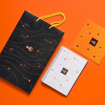
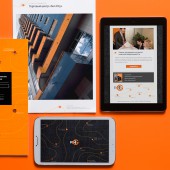
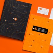
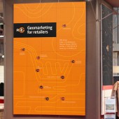
| DESIGN NAME: RRG PRIMARY FUNCTION: Corporate Identity INSPIRATION: As geomarketing is key expertise of RRG, we based the new identity around stylized artistic representations of a topographic map. The resulted “geomaps” rendered in RRG colours of white, black and orange were applied throughout all stationery, documentation and corporate materials. UNIQUE PROPERTIES / PROJECT DESCRIPTION: RRG provides full scope of services such as geomarketing, consulting, brokerage, management etc. in Russian commercial real estate market. On its 10th anniversary the company decided to rebrand while preserving intact its existing logo. The new identity sees stylized artistic maps, nicknamed "RRG geomaps" added to the visual application of the brand. In some cases, for advertising etc. these geomaps can incorporate stylized linear graphics thus providing a versatile and adaptable visual device. OPERATION / FLOW / INTERACTION: Main graphic features of a map, such as isolines and grid are also present in RRG “geomaps”, beads represent place marks on a map, names of RRG services and areas of activities are used instead of place names. PROJECT DURATION AND LOCATION: 2015-2016, Moscow FITS BEST INTO CATEGORY: Graphics, Illustration and Visual Communication Design |
PRODUCTION / REALIZATION TECHNOLOGY: images for RRG “geomaps” were created using photographs of beads on paper backgrounds and superimposed with vector isolines. SPECIFICATIONS / TECHNICAL PROPERTIES: stationery, corporate documentation, reports and publications, brochures, exhibition posters TAGS: geomarketing, retail, beads, topography, map, development, research, isoline RESEARCH ABSTRACT: - CHALLENGE: The existing logo of RRG should remain intact, that’s why we were forced to place more emphasis on brand graphics and invent a new visual device compatible with the existing logo. ADDED DATE: 2016-09-20 18:41:42 TEAM MEMBERS (1) : Oleg Vvedensky IMAGE CREDITS: Mikhail Puzakov, 2016. |
||||
| Visit the following page to learn more: http://www.behance.net/gallery/41899891/ |
|||||
| AWARD DETAILS | |
 |
Rrg Corporate Identity by Mikhail Puzakov is Winner in Graphics, Illustration and Visual Communication Design Category, 2016 - 2017.· Read the interview with designer Mikhail Puzakov for design RRG here.· Press Members: Login or Register to request an exclusive interview with Mikhail Puzakov. · Click here to register inorder to view the profile and other works by Mikhail Puzakov. |
| SOCIAL |
| + Add to Likes / Favorites | Send to My Email | Comment | Testimonials | View Press-Release | Press Kit |
Did you like Mikhail Puzakov's Graphic Design?
You will most likely enjoy other award winning graphic design as well.
Click here to view more Award Winning Graphic Design.


