Home Event Activation by Beck Storer and Paul Meeuwsen |
Home > Winners > #49514 |
 |
|
||||
| DESIGN DETAILS | |||||
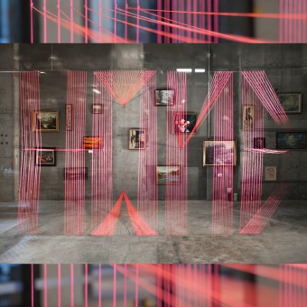
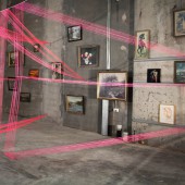
| DESIGN NAME: Home PRIMARY FUNCTION: Event Activation INSPIRATION: Wanting to craft an emotive message to the public, our inspiration came from our love for typography Home is a creative piece that embraces the nostalgia of one’s home and is a mish mash of the old and the new. Vintage 1960 paintings covered the back wall, combined with a loud bright contemporary message created from many metres of string (actually 1000 metres!). UNIQUE PROPERTIES / PROJECT DESCRIPTION: The string plays an important role of tricking the eye, at certain angles it appears 3D, encouraging the viewer to actually question what are they seeing. Is it a word, or is it a pattern? Am I seeing letters, or are these shapes? Small personal memento’s were also included the installation, a High School drawing, a classic album cover of Flashdance, evoking memories of one’s home. OPERATION / FLOW / INTERACTION: The public engaged with the installation by viewing it at different angles, questioning what they were actually seeing. They were also encouraged to post images of it on Instagram, asking a broader public how they would interpret the image, thus continuing the enquire into how people would deconstruct and interpret the typographic installation. PROJECT DURATION AND LOCATION: The project started in October 2015 and lasted for one week in Melbourne, AUSTRALIA. FITS BEST INTO CATEGORY: Graphics, Illustration and Visual Communication Design |
PRODUCTION / REALIZATION TECHNOLOGY: The main material used for this installation was over 1000 meters of fluorescent pink string to craft the typographic message of Home. Technically we had to be very mindful of how taught (strong) the string could be to ensure we could tie it from the one point in multiple angles, both vertically and horizontally. SPECIFICATIONS / TECHNICAL PROPERTIES: We used over 1000 metres of pink string to create the word Home! TAGS: typography, graphic design, spatial, sculpture, type, colour,installation, exhibition, art RESEARCH ABSTRACT: Our love for typography helped us immensely to explore a tactile outcome when creating Home. Lucky for us, Paul is a lecturer in typography, so we had a solid foundation of knowledge to start from. Many sketches and iterations were drawn exploring options in how to craft the word, using multiple grids and type systems. CHALLENGE: Considering we were attempting to craft the word Home mid air on a wire, then weaving it backwards onto a wall, getting the string taunt (ensuring it was tight in every piece) became a major headache for us. Half way through the creation of the installation the entire word collapsed! From this slight disaster, we were able to review areas of weakness in the string and were abled to quickly finalise the installation. ADDED DATE: 2016-07-04 12:47:50 TEAM MEMBERS (2) : Creative Director: Beck Storer and Creative Director: Paul Meeuswen IMAGE CREDITS: Image#1: Rikki Bunder Image#2: Rikki Bunder Image#3: Rikki Bunder Image#4: Rikki Bunder Image#5: Rikki Bunder |
||||
| Visit the following page to learn more: https://www.thecutaway.com.au | |||||
| AWARD DETAILS | |
 |
Home Event Activation by Beck Storer and Paul Meeuwsen is Winner in Fine Arts and Art Installation Design Category, 2016 - 2017.· Read the interview with designer Beck Storer and Paul Meeuwsen for design Home here.· Press Members: Login or Register to request an exclusive interview with Beck Storer and Paul Meeuwsen. · Click here to register inorder to view the profile and other works by Beck Storer and Paul Meeuwsen. |
| SOCIAL |
| + Add to Likes / Favorites | Send to My Email | Comment | Testimonials | View Press-Release | Press Kit | Translations |
Did you like Beck Storer and Paul Meeuwsen's Fine Art Design?
You will most likely enjoy other award winning fine art design as well.
Click here to view more Award Winning Fine Art Design.


