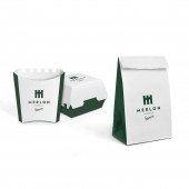
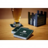
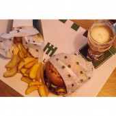
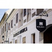
Merlon Pub Identity, Branding by Leo Vinkovic & Igor Penovic - Studio 33 |
Home > Winners > #49504 |
 |
|
||||
| DESIGN DETAILS | |||||
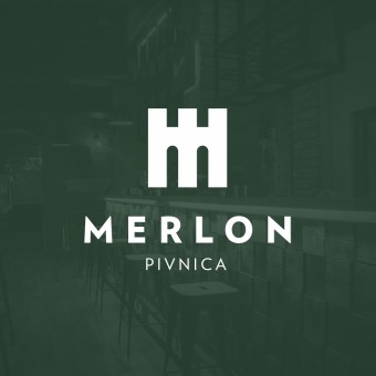
| DESIGN NAME: Merlon Pub PRIMARY FUNCTION: Identity, Branding INSPIRATION: The project represents an entire branding of a new catering facility within Tvrđa in Osijek, the old Baroque town center, built in the 18th century as part of a large system of strategically fortified towns. UNIQUE PROPERTIES / PROJECT DESCRIPTION: Merlon (parapet) means solid, upright fences designed to protect the observers and the military at the top of the fort. In addition to the name directly corresponding to the tradition of Tvrđa, it is also catchy, so it offers authenticity with which the guests of the Pub can identify. OPERATION / FLOW / INTERACTION: Immediately after opening it has become the most popular place and pub in town. PROJECT DURATION AND LOCATION: The project started in September 2015 in Osijek and finished in December 2015 in Osijek FITS BEST INTO CATEGORY: Graphics, Illustration and Visual Communication Design |
PRODUCTION / REALIZATION TECHNOLOGY: - SPECIFICATIONS / TECHNICAL PROPERTIES: - TAGS: logo, identity, branding, trademark, symbol, pub, beer, restaurant, RESEARCH ABSTRACT: The naming process of the pub involved a comprehensive research of Tvrđa’s history, with an emphasis on its development, urban planning, architecture, content, and culture. The research helped form the belief that the name of the pub (or any other part of Tvrđa) should remain associated with the historical identity of the place. Therefore, the name Merlon (parapet) was selected. In the defense architecture, the name means solid, upright fences designed to protect the observers and the military at the top of the fort. CHALLENGE: - ADDED DATE: 2016-07-02 07:52:34 TEAM MEMBERS (2) : Designer: Leo Vinkovic and Designer: Igor Penovic IMAGE CREDITS: Photographer Josip Bilic, SIB, 2015 |
||||
| Visit the following page to learn more: https://www.behance.net/gallery/32432343 |
|||||
| AWARD DETAILS | |
 |
Merlon Pub Identity, Branding by Leo Vinkovic & Igor Penovic-studio 33 is Winner in Graphics, Illustration and Visual Communication Design Category, 2016 - 2017.· Read the interview with designer Leo Vinkovic & Igor Penovic - Studio 33 for design Merlon Pub here.· Press Members: Login or Register to request an exclusive interview with Leo Vinkovic & Igor Penovic - Studio 33. · Click here to register inorder to view the profile and other works by Leo Vinkovic & Igor Penovic - Studio 33. |
| SOCIAL |
| + Add to Likes / Favorites | Send to My Email | Comment | Testimonials | View Press-Release | Press Kit | Translations |
Did you like Leo Vinkovic & Igor Penovic-Studio 33's Graphic Design?
You will most likely enjoy other award winning graphic design as well.
Click here to view more Award Winning Graphic Design.


