PDcoffee VIS Design by Tsung-Hua Yang |
Home > Winners > #49503 |
 |
|
||||
| DESIGN DETAILS | |||||
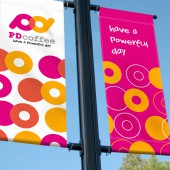
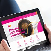
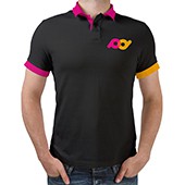
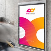
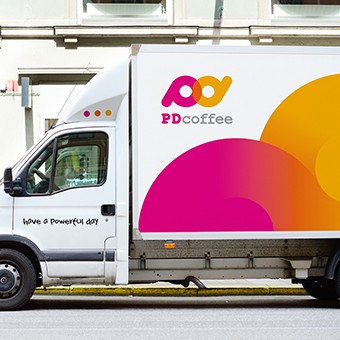
| DESIGN NAME: PDcoffee PRIMARY FUNCTION: VIS Design INSPIRATION: The establishment of PDcoffee builds upon the passion for and sharing of coffee. Its mobile coffee trucks travel to various tourist attractions and offer drop-over brewed coffee and to promote coffee culture. In response to PDcoffee’s goals, among all the qualities of coffee, energy and refreshing are adopted as the core value of the brand, which matches PDcoffee’s operation strategy and hopes to deliver the message: have a powerful day. Based on this concept, a series of identity ideas is also conveyed. In addition, mobility, interaction, and energy are emphasized in the design to enhance the brand’s first impression. UNIQUE PROPERTIES / PROJECT DESCRIPTION: The logo design highlights the interplay between lowercase letter p and d. The magenta p symbolizes PDcoffee owners passionately holding up the coffee for their customers. Rotating the letter p counterclockwise by 180 degrees, we will see the yellow-orange d, which represents the customers carrying PDcoffee’s products in hands with expectation. To see the logo as a whole, the two letters are integrated together, indicating the interaction between PDcoffee and customers. And the character of the brand gradually formed and vividly shaped. Developed from the brand logo, the series of visual designs centers on vitality and activeness, attempting to deliver a sense of freshness and pleasure to the customers, whereas the consistency of the designs deeply delineates the image of the brand. OPERATION / FLOW / INTERACTION: PDcoffee is born out of love for coffee and the passion vendor has to share the beauty of coffee to the public. And based on the value of powering people up with a cup of coffee, it hopes to build a deeper connection between coffee and people. PROJECT DURATION AND LOCATION: Started in March 2016 and finished in June 2015 in Taichung City, Taiwan(R.O.C.). FITS BEST INTO CATEGORY: Graphics, Illustration and Visual Communication Design |
PRODUCTION / REALIZATION TECHNOLOGY: Business card printing with Pantone color and spot varnish, banner made with canvas, mobile diner body made with the computer shears the character and playbill output. SPECIFICATIONS / TECHNICAL PROPERTIES: Mobile diner body: Width 200 cm x Height 117 cm. Canvas banner: Width 60 cm x Height 180 cm. Poster: Width 100 cm x Height 150 cm. TAGS: VIS, Branding, logo, Identity, coffee, mobile coffee truck, powerful RESEARCH ABSTRACT: We found that because of the maturity and universality of the Taiwanese coffee market, drinking coffee had become a daily habit for Taiwanese people. Through our research and understanding of coffee, as well as the concept of coffee our clients had, we reached a consensus and came up with a design focus. CHALLENGE: As distinct from a typical coffee shop, PDcoffee is mobile, and can travel from one tourist site to another. We thus had to spend a large amount of time in researching and testing in order to form an identity that matches its surroundings, while still being conspicuous to the consumer. ADDED DATE: 2016-07-02 05:58:02 TEAM MEMBERS (1) : Design Director: Yen Yang IMAGE CREDITS: BYEn , Taiwan (R.O.C), 2016 |
||||
| Visit the following page to learn more: http://www.byen.biz | |||||
| AWARD DETAILS | |
 |
Pdcoffee Vis Design by Tsung-Hua Yang is Winner in Graphics, Illustration and Visual Communication Design Category, 2016 - 2017.· Read the interview with designer Tsung-Hua Yang for design PDcoffee here.· Press Members: Login or Register to request an exclusive interview with Tsung-Hua Yang. · Click here to register inorder to view the profile and other works by Tsung-Hua Yang. |
| SOCIAL |
| + Add to Likes / Favorites | Send to My Email | Comment | Testimonials | View Press-Release | Press Kit |
Did you like Tsung-Hua Yang's Graphic Design?
You will most likely enjoy other award winning graphic design as well.
Click here to view more Award Winning Graphic Design.


