Sananoor Co. Corporate Identity Corporate Identity by Radiant Creatives |
Home > Winners > #47146 |
 |
|
||||
| DESIGN DETAILS | |||||
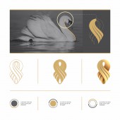
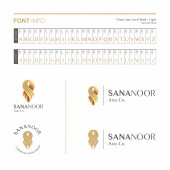
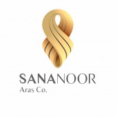
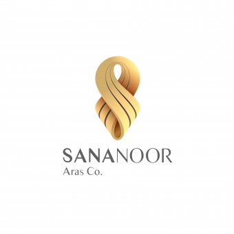
| DESIGN NAME: Sananoor Co. Corporate Identity PRIMARY FUNCTION: Corporate Identity INSPIRATION: Taking cue from one of nature's most beautiful and inspiring creatures, the swan, we came up with several logo prototypes. We wanted to create a symmetrical shape that radiates a sophisticated, luxurious style that has a taste for both classic and modern aesthetics. This idea was in mind for choosing and designing the typeface and theme as well. This is why the color Gold was selected as our primary color extended by lighter, secondary colors. UNIQUE PROPERTIES / PROJECT DESCRIPTION: Sananoor Co. is a rapidly rising agency in Iran, primarily functioning in creating and renovating medium to large commercial centers in its capital: Tehran. Radiant Creatives were assigned to create a classy, sophisticated and modern corporate identity for Sananoor reflecting their luxurious brand. OPERATION / FLOW / INTERACTION: It was our main focus to create a uniquely luxurious brand logo for Sananoor Co. However, we recognize simplicity and respect minimal design in our works, therefore we had to consort to a more symbolic approach towards our idea. What is seen in the final results convey the luxury and high-class position of the brand as well as having natural and geometrical curves that resemble the wings and neck of a swan. PROJECT DURATION AND LOCATION: The project started in October 2015 and ended by December 2015. It was officially selected by the company's board members as the company's new identity from 2016. FITS BEST INTO CATEGORY: Graphics, Illustration and Visual Communication Design |
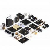
PRODUCTION / REALIZATION TECHNOLOGY: Sketches and brainstorming, Corel Draw X7, Adobe Photoshop, Adobe Illustrator SPECIFICATIONS / TECHNICAL PROPERTIES: Logo design and theme are vector based graphics, all other assets are mockup designs created inside Adobe Photoshop. Created on a PC system. TAGS: Logo, graphic design, swan, corporate identity, luxury, trademark, sign, gold RESEARCH ABSTRACT: The name of our client, "Sananoor" is consisted of two parts: "Sana+noor" CHALLENGE: The hardest part of this project was overcoming the design obstacles usually set by clients who assume that a brand's logo design should to some extent (or sometimes exactly) the nature of the brand's activity. We had to persuade them after several meetings to bring a more natural and symbolic view towards creating their trademark. ADDED DATE: 2016-02-28 13:44:41 TEAM MEMBERS (3) : Mohsen Beygzadeh, Hamed Taleghani and Navid Kosari Fard IMAGE CREDITS: Radiant Creatives, 2015. PATENTS/COPYRIGHTS: Copyrights belong to Sananoor Co., 2016 |
||||
| Visit the following page to learn more: http://sananoor.co | |||||
| AWARD DETAILS | |
 |
Sananoor Co. Corporate Identity Corporate Identity by Radiant Creatives is Winner in Graphics, Illustration and Visual Communication Design Category, 2015 - 2016.· Read the interview with designer Radiant Creatives for design Sananoor Co. Corporate Identity here.· Press Members: Login or Register to request an exclusive interview with Radiant Creatives. · Click here to register inorder to view the profile and other works by Radiant Creatives. |
| SOCIAL |
| + Add to Likes / Favorites | Send to My Email | Comment | Testimonials | View Press-Release | Press Kit |
Did you like Radiant Creatives' Graphic Design?
You will most likely enjoy other award winning graphic design as well.
Click here to view more Award Winning Graphic Design.


