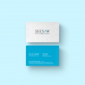
SeeSaw Corporate Identity by Bel Koo |
Home > Winners > #45959 |
 |
|
||||
| DESIGN DETAILS | |||||
| DESIGN NAME: SeeSaw PRIMARY FUNCTION: Corporate Identity INSPIRATION: The main identity of the brand and hidden meaning is a eye diagram - 'How the human eyes sees, How light travels into eye' and letter 'A' to complete a logo and represents the brand See and Saw. UNIQUE PROPERTIES / PROJECT DESCRIPTION: Logo design for SeeSaw Optometrist. SeeSaw Optometrists who are professional and qualified to provide comprehensive eye care. Client would like to have a new concept logo instead of commonly use design based on spectacles design or eye shape design. The main identity of the brand and hidden meaning is a eye diagram - 'How the human eyes sees, how light travels into eye' and letter A to complete a logo and represents the brand See and Saw. OPERATION / FLOW / INTERACTION: Our direction for approach is the combination of the main letters in the brand name and using the eye diagram to make the geometric signature. PROJECT DURATION AND LOCATION: The project started in April 2014 in Malaysia and finished in June 2014 in Malaysia. FITS BEST INTO CATEGORY: Graphics, Illustration and Visual Communication Design |
PRODUCTION / REALIZATION TECHNOLOGY: Sketches, Adobe Illustrator SPECIFICATIONS / TECHNICAL PROPERTIES: Business Card 90mm x 50mm TAGS: seesaw, optometrist, logo design, identity, malaysia RESEARCH ABSTRACT: Research and understanding of how the human eyes works. CHALLENGE: How to express the 'See' 'Saw' and creates a unique logo. Client wanted to create a unique logo that represent the brand instead of commonly use designs based on spectacles or eye shape design. ADDED DATE: 2016-02-23 05:47:49 TEAM MEMBERS (1) : Bel Koo IMAGE CREDITS: Bel Koo |
||||
| Visit the following page to learn more: http://www.dream-design.net | |||||
| AWARD DETAILS | |
 |
Seesaw Corporate Identity by Bel Koo is Winner in Graphics, Illustration and Visual Communication Design Category, 2016 - 2017.· Read the interview with designer Bel Koo for design SeeSaw here.· Press Members: Login or Register to request an exclusive interview with Bel Koo. · Click here to register inorder to view the profile and other works by Bel Koo. |
| SOCIAL |
| + Add to Likes / Favorites | Send to My Email | Comment | Testimonials | View Press-Release | Press Kit |
Did you like Bel Koo's Graphic Design?
You will most likely enjoy other award winning graphic design as well.
Click here to view more Award Winning Graphic Design.


