Borandá Visual Identity by Gabriela Namie & André Jun Ioneda |
Home > Winners > #42916 |
 |
|
||||
| DESIGN DETAILS | |||||
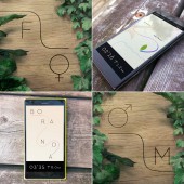
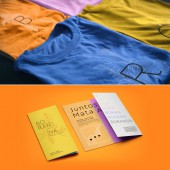
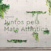
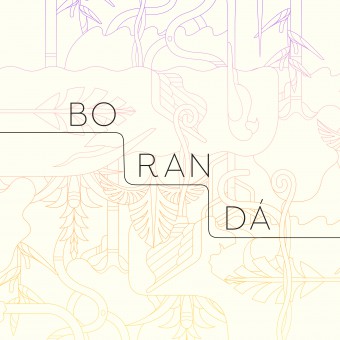
| DESIGN NAME: Borandá PRIMARY FUNCTION: Visual Identity INSPIRATION: Boranda is a WWF initiative that aims to encourage society to visit Atlantic Rain Forest's units. Movement's name is the contraction of the expressions "bora" (let's) and "andar" (walk), that together sounds like an indigenous word and also call audience to action. Visual identity creates a path of conservation unit's trails and the line camouflages itself in the identity and illustrations in a playful message: to visit Atlantic Rain Forest is to preserve it. Inspiration for the project came from the nature itself by its organic and colourful shapes and the urban scenario, which is the context of the main audience. UNIQUE PROPERTIES / PROJECT DESCRIPTION: Organic and colourful shapes from the nature were the main inspiration for this project. This feature is not only applied to the illustration style and type design but also in the modular shapes of the logo, that can be adjusted to trail's lines. In contrast to it, we also have a urban and modern visual identity that relates itself to a very important audience – those ones who are not used to visit conservation units. OPERATION / FLOW / INTERACTION: The identity is based on a main line that keeps track of other brand's elements around it – illustrations, logo and texts. Because of its malleability, playfulness and simplicity, this identity can be easily incorporated in the Atlantic Rainforest and promotional materials, managing to stand out both in this scenario and big cities. PROJECT DURATION AND LOCATION: The project started in February 2015 in São Paulo and finished in September 2015 in São Paulo, and was launched in Curitiba in September 2015. FITS BEST INTO CATEGORY: Graphics, Illustration and Visual Communication Design |
PRODUCTION / REALIZATION TECHNOLOGY: WWF, Together and Barca worked in the research for visual identity. Together Agency conducted a marketing plan and studied context and target. Barca visited conservation units, talked to administrators of trails to create a briefing. After realising the main target would be big cities, Barca created a few paths for visual identity. Then, elements were tested in digital media and in the trail, since it was necessary to have signals easily produced by trail staff and applied in stencil on trees. SPECIFICATIONS / TECHNICAL PROPERTIES: Five logo versions were created based on trail lines. They exist in RGB and CMYK color profiles in .png, .jpg, .ai, .pdf and .eps. Institutional colors of main pallete are: Orange (#fbb172; R 251 G 277 B 114, C 0 M 35 Y 70 K 0, PANTONE 123 U), Yellow (#ffe25d, R 255 G 226 B 93, C 0 M 5 Y 75 K 0, PANTONE Yellow U), Pink (#f195ff, R 241 G 149 B 255, C 15 M 45 Y 0 K 0, Pantone 244 U), Purple (#9060f1, R 144 G 96 B 241, C 60 M 70 Y 0 K 0, PANTONE Violet U) and Blue (#4685fa, R 70 G 133 B 250, C 70 M 50 Y 0 K 0, PANTONE Process Blue U). TAGS: boranda, wwf, atlantic rain forest, nature, identity RESEARCH ABSTRACT: After visiting conservation units, Barca Studio promoted a workshop with WWF team and talked to units' administrators to understand better the needs for the brand. Also, the research company Together produced an audience and context study to provide insights for visual identity. It became clear the brand needed to connect both with people who are used to visit the units but mainly with those ones who do not. That is the reason the brand is both modern and urban but also deeply connects with organic and colorful shapes from the forest. CHALLENGE: The main creative challenge was to develop a visual identity system that connects with the organic and colorful Atlantic Rainforest but also with the urban audience. The team approving the work were both WWF members but also all the trails' administrators along the Serra do Mar mountains, which runs parallel to the Atlantic Ocean coast from the state of Espirito Santo to southern Santa Catarina. The great amount of people approving the brand made sure that it connected to the context and their needs. ADDED DATE: 2015-09-26 22:36:07 TEAM MEMBERS (2) : Graphic designer and Creative director: Gabriela Namie and Graphic designer and Creative director: Andre Jun Ioneda IMAGE CREDITS: Gabriela Namie Andre Jun Ioneda |
||||
| Visit the following page to learn more: https://www.wearebarca.com | |||||
| AWARD DETAILS | |
 |
Borandá Visual Identity by Gabriela Namie & André Jun Ioneda is Winner in Graphics, Illustration and Visual Communication Design Category, 2015 - 2016.· Read the interview with designer Gabriela Namie & André Jun Ioneda for design Borandá here.· Press Members: Login or Register to request an exclusive interview with Gabriela Namie & André Jun Ioneda. · Click here to register inorder to view the profile and other works by Gabriela Namie & André Jun Ioneda. |
| SOCIAL |
| + Add to Likes / Favorites | Send to My Email | Comment | Testimonials | View Press-Release | Press Kit |
Did you like Gabriela Namie & André Jun Ioneda's Graphic Design?
You will most likely enjoy other award winning graphic design as well.
Click here to view more Award Winning Graphic Design.


