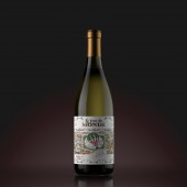
Le Tour De Monde Series of European wines by Valerii Sumilov |
Home > Winners > #42855 |
 |
|
||||
| DESIGN DETAILS | |||||
| DESIGN NAME: Le Tour De Monde PRIMARY FUNCTION: Series of European wines INSPIRATION: The base for this concept is the air balloon travel plot from the popular adventure novel Around the world in 80 days (Le tour du monde en quatre-vingts jours) by French author Jules Verne. This novel inspired us to develop a so-called vintage design. The plot's main idea - landmarks from 4 different European countries - France, Germany, Spain and Italy. UNIQUE PROPERTIES / PROJECT DESCRIPTION: Each product in the line is represented with a unique storyline, which reflects the main landmarks of the country that the wine comes from, all depicted in a vintage style. This project combines the classic spirit of Verne's novels in their aesthetics with the geographic classification of the wines themselves. The round label enveloping the bottle stimulates interaction, making the potential buyer take it from the shelf and look through the story in detail. OPERATION / FLOW / INTERACTION: The label wraps around the entire bottle. The plot is different for each bottle and is fully disclosed throughout the label's entire length, showing the major landmarks of each country. This interesting, exclusive design will certainly catch the consumer's eye, make him take the bottle and look at it more closely. Thus, the consumer interacts with the product well before purchasing it, which stimulates potential sales. PROJECT DURATION AND LOCATION: The project started in October 2014 and was concluded 2014. The product appeared on Russian market shelves in 2015. FITS BEST INTO CATEGORY: Packaging Design |
PRODUCTION / REALIZATION TECHNOLOGY: While developing this design we've provided employment of modern printing and post-printing techniques such as foil stamping, embossing and the application of tactile varnish. The printing was carried out using high quality artistic paper, which allowed, in combination with various techniques, obtaining the best embodiment for the packing and providing the best sensations while handling the product near the product shelf. SPECIFICATIONS / TECHNICAL PROPERTIES: Label dimensions: 249 mm in length and 100 mm in width. The label is glued around the bottle's entire circumference thus forming a continuous line. TAGS: Valerii, Sumilov, packaging design, labels design, SHUMILOVEDESIGN RESEARCH ABSTRACT: The agency has done an extensive body of preparation work while creating the design concepts and improving the final solution. Various opinions have been gathered and different visuals have been employed to study the potential impact of the product. As a result, the final solution looks both vintage as a book illustration and rather modern as to cater to the target audience's expectations. CHALLENGE: The main artistic challenge was creating a packing that would combine a vintage style with detailed depictions of various landmarks while not making the label look too busy from the visual standpoint. It was necessary to reach a balance between a potentially high quantity of elements and the label's overall harmony. A lot of work was done to achieve this goal. ADDED DATE: 2015-09-25 14:06:55 TEAM MEMBERS (1) : Valerii Sumilov IMAGE CREDITS: Image #1: 3D visualization Maxim Kulikov Image #2: 3D visualization Maxim Kulikov Image #3: 3D visualization Maxim Kulikov Image #4: 3D visualization Maxim Kulikov Image #5: 3D visualization Maxim Kulikov |
||||
| Visit the following page to learn more: http://bit.ly/1RpCBjO | |||||
| AWARD DETAILS | |
 |
Le Tour De Monde Series of European Wines by Valerii Sumilov is Winner in Packaging Design Category, 2015 - 2016.· Read the interview with designer Valerii Sumilov for design Le Tour De Monde here.· Press Members: Login or Register to request an exclusive interview with Valerii Sumilov. · Click here to register inorder to view the profile and other works by Valerii Sumilov. |
| SOCIAL |
| + Add to Likes / Favorites | Send to My Email | Comment | Testimonials | View Press-Release | Press Kit |
Did you like Valerii Sumilov's Packaging Design?
You will most likely enjoy other award winning packaging design as well.
Click here to view more Award Winning Packaging Design.


