Monochromatic Space Residential House by Summerhaus D'zign Pte Ltd |
Home > Winners > #41632 |
 |
|
||||
| DESIGN DETAILS | |||||
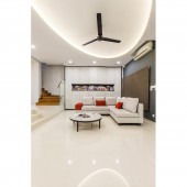
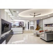
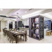
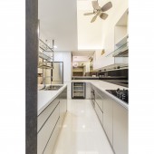
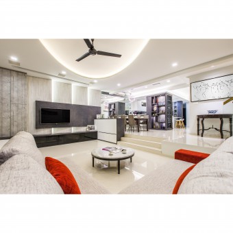
| DESIGN NAME: Monochromatic Space PRIMARY FUNCTION: Residential House INSPIRATION: Simplicity was key in the house. As such, colors and shapes were kept to a minimum. The team took inspiration from monochromes. Shades of grey were employed and rectangles were used throughout the living room in different angles. UNIQUE PROPERTIES / PROJECT DESCRIPTION: In the heart of the Monochromatic Space is simplicity. The goal was to be simple yet exuberating a sense of warmth for the family. The entire ground floor was given an overhaul taking on an open concept to give a sense of spaciousness. Two lighting options was given - cove lights or down lights, giving the family flexibility to select different ambiance suitable for the occasion. OPERATION / FLOW / INTERACTION: The entire living room presents a very comfortable space for family members to gather around. There is a projector screen hidden in the ceiling, coupled with recessed speakers in the ceiling, offering a great time of bonding and fun. PROJECT DURATION AND LOCATION: The project started in September 2014 in Singapore and completed in December 2014. FITS BEST INTO CATEGORY: Interior Space and Exhibition Design |
PRODUCTION / REALIZATION TECHNOLOGY: The overall space was finished using decorative laminates of different textures giving different level of depths to the space. To accurately construct the angles, the carpenters had to create a sample model to ensure the cabinetry fit perfectly. SPECIFICATIONS / TECHNICAL PROPERTIES: The angled cabinet opposite the TV console is Width: 4030mm x Depth: 540mm x Height: 3000mm The TV console together with the attached settee at the side measures Width: 6479mm x Depth: 500mm x Height: 3089mm. TAGS: Contemporary living room, Interior design for landed house, Monochrome living room, Singapore interior design, Luxury interior design RESEARCH ABSTRACT: In the heart of this design concept lies simplicity. The owners wanted a modern yet not overly complicated design. The team decided on grey as the base colour and rectangle as the main shape to achieve a monochromatic feel. Various textures were used to bring contrast and depth, complemented by lights to emphasise different areas. An ellipse oval cove lighting illuminates the living room whilst balancing the rectangles around to eliminate the sense of boxiness. CHALLENGE: The hardest part of constructing the living room was at the angled full height cabinet opposite the TV console. Exact calculations of angles had to be determined and yet accommodate the hinges that are available. An angle too steep means it will be difficult for the owners to use the compartments and hard for construction as doors will be obstructed while swinging. ADDED DATE: 2015-06-22 11:31:21 TEAM MEMBERS (1) : Managing Partner: Larry Lim, Principle: Jess Koh and Senior Conceptualizer: Jenno Misa IMAGE CREDITS: Photographer: Darren Francis Photography |
||||
| Visit the following page to learn more: http://www.summerhaus.com.sg | |||||
| AWARD DETAILS | |
 |
Monochromatic Space Residential House by Summerhaus D'zign Pte Ltd is Winner in Interior Space and Exhibition Design Category, 2015 - 2016.· Read the interview with designer Summerhaus D'zign Pte Ltd for design Monochromatic Space here.· Press Members: Login or Register to request an exclusive interview with Summerhaus D'zign Pte Ltd. · Click here to register inorder to view the profile and other works by Summerhaus D'zign Pte Ltd. |
| SOCIAL |
| + Add to Likes / Favorites | Send to My Email | Comment | Testimonials | View Press-Release | Press Kit | Translations |
Did you like Summerhaus D'zign Pte Ltd's Interior Design?
You will most likely enjoy other award winning interior design as well.
Click here to view more Award Winning Interior Design.


