DESIGN NAME:
Roomer
PRIMARY FUNCTION:
Corporate identity
INSPIRATION:
The idea of the name was born out of modern Moscow way of life, where most furniture buyers are often young working professionals living mainly in their own flats and apartments or renting them. The new shopping mall unlike its competitors is located in the centre of Moscow where there are very few private houses, so special emphasis was put on furnishing flats and apartments while main competitors are based in suburban areas and target both flat owners and private house owners.
UNIQUE PROPERTIES / PROJECT DESCRIPTION:
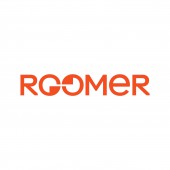
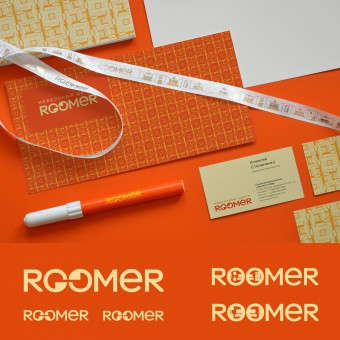
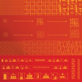
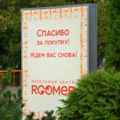
Roomer is a new large furniture shopping mall, located almost in the centre of Moscow. Double "O" in the name "roomer" visually represents glasses (or binoculars). This symbolism is no accidental, as the mall building is very long in size. Logo variations can contain abstract, stylized forms inside the "glasses", or, when the logo is used in large sizes, more detailed images can be placed there. The pattern tiles are made of stylized schemes of flat layouts.
OPERATION / FLOW / INTERACTION:
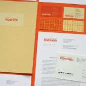
Logo and Graphics for shopping mall brand should work well both on the outdoor sign, and on the business cards. These terms of use of the brand`s graphics have been fully implemented in this project.
PROJECT DURATION AND LOCATION:
2012-2013
FITS BEST INTO CATEGORY:
Graphics, Illustration and Visual Communication Design
|
PRODUCTION / REALIZATION TECHNOLOGY:
Graphic solution for the shopping mall is designed for use in the widest fields of advertising and printing, from outdoor advertising to branded souvenirs. And this is an important criterion for graphics of such category.
SPECIFICATIONS / TECHNICAL PROPERTIES:
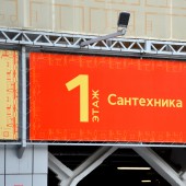
stationery, outdoor and indoor signage, navigation, promotional materials
TAGS:
furniture mall, flat layouts, pattern, binoculars, zoom, suite of rooms
RESEARCH ABSTRACT:
The choice of brand name and color palette was made after studying the competition and architecture of the new mall building. Name spelt in Latin differentiates the brand from the competition having only Cyrillic-spelt names. Orange color is present in the mall building front, this bright and popular color is not used by main direct competitors, but favored by other large successful retail brands (such as OBI etc.)
CHALLENGE:
Furniture shopping mall’s brand should extend to any kind of furniture that sells inside the mall under other brands which have their own identity and style. Branding touchpoints inside the mall are limited due to the strong presence of furniture and other product brands; outdoor branding is defined by architecture of the mall and should be approved by the city’s authorities. That’s why the right choice of brand name, logotype and main color were crucial to the success of the new mall. The short, clear name, changeable logo and vivid warm color proved to be quite successful.
ADDED DATE:
2015-06-18 20:42:25
TEAM MEMBERS (1) :
Oleg Vvedensky
IMAGE CREDITS:
Image #1 : Photographer Oleg Vvedensky
Image #2 : Photographer Oleg Vvedensky
Image #3 : Photographer Oleg Vvedensky
Image #4 : Photographer Mikhail Puzakov
Image #5 : Photographer Oleg Vvedensky
|
