IUPY SushiBar & Temakeria Restaurant by Marcelo Lopes |
Home > Winners > #40523 |
 |
|
||||
| DESIGN DETAILS | |||||
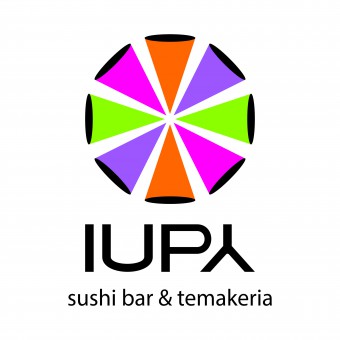
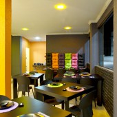
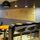
| DESIGN NAME: IUPY SushiBar & Temakeria PRIMARY FUNCTION: Restaurant INSPIRATION: Pop-art and innovation furniture design. The trademark of the pop art style is the strong, intense, fluorescent and vibrant colors! Pin-ups are yet another strong element of pop culture! Pop culture is present in the furniture in the styrofoam-filled puffs! A laid-back attitude as part of a lifestyle. It was the inspiration for the new japonese restaurant. See the aploaded document file to have a better explanation of the project. UNIQUE PROPERTIES / PROJECT DESCRIPTION: Creation of a brand in which innovation and interaction between people and the environment must be seen in the details. Presentation of a fun and light environment that stands out when compared to most sushi bars and temaki places currently in the market. The purpose was for the design to specifically be unrelated to the Japanese setting/environmenta OPERATION / FLOW / INTERACTION: Cardboard panels with famous quotes to enable interaction with the public. The quotes are also printed on the hashi holders. In order for the brand experience to interact with the public, and thanks to their low environmental impact, the recycled cardboard panels are changed every quarter. PROJECT DURATION AND LOCATION: South coast of Sao Paulo, Brasil. This project takes three months. FITS BEST INTO CATEGORY: Graphics, Illustration and Visual Communication Design |
PRODUCTION / REALIZATION TECHNOLOGY: The restaurant is located at a beach city and taking into account that it was meant to be fun, light and unpretentious, we presented a design that enabled the different areas of the restaurant to have different atmospheres, so that clients could not only enjoy having different options, but also feel comfortable there. The restaurant brings the influence of pop culture in its colors and a contemporary fare thanks to the innovative design of its furniture, especially in the tables with holes used as support for the sous-plats. SPECIFICATIONS / TECHNICAL PROPERTIES: The restaurant has a hundred square meters and was divided into three environments: Counter, lounge and table area. The tables was made for two, three , four or eight people. TAGS: Branding design, logo, sensorial design. furniture design, restaurant, Brazil, Marcelo lopes designer RESEARCH ABSTRACT: Table with holes to support the sous-plats offer a unique personality for the restaurant. Sustainability: Bamboo hashi (100% sustainable) dyed in the two brand colors packed with certified FSC paper printed in the other two brand colors. Cardboard panels to enable interaction with the public. The quotes are also printed on the hashi holders. In order for the brand experience to interact with the public. Low environmental impact, recycled cardboard panels. Interactive: The phrases are transferred from the panels to the hashi holders. CHALLENGE: The Innovation, the space, the interaction, the detail and communication bringing together the purposes of the new brand. One project 100% integrated. The phrases are transferred from the panels to the hashi holders. In order for the brand experience to interact with the public, and thanks to their low environmental impact, the recycled cardboard panels are changed every quarter. ADDED DATE: 2015-03-04 14:37:27 TEAM MEMBERS (2) : Marcelo Lopes and Patricia Eddel IMAGE CREDITS: Sérgio Guerini Ivan Bertasi |
||||
| Visit the following page to learn more: http://merchan-design.com.br | |||||
| AWARD DETAILS | |
 |
Iupy Sushibar & Temakeria Restaurant by Marcelo Lopes is Winner in Graphics, Illustration and Visual Communication Design Category, 2014 - 2015.· Read the interview with designer Marcelo Lopes for design IUPY SushiBar & Temakeria here.· Press Members: Login or Register to request an exclusive interview with Marcelo Lopes. · Click here to register inorder to view the profile and other works by Marcelo Lopes. |
| SOCIAL |
| + Add to Likes / Favorites | Send to My Email | Comment | Testimonials | View Press-Release | Press Kit |
Did you like Marcelo Lopes' Graphic Design?
You will most likely enjoy other award winning graphic design as well.
Click here to view more Award Winning Graphic Design.


