Beer Flood Porter Label by Evgeny Dyakonov |
Home > Winners > #39084 |
 |
|
||||
| DESIGN DETAILS | |||||
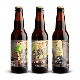
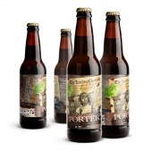
| DESIGN NAME: Beer Flood Porter PRIMARY FUNCTION: Label INSPIRATION: The event, the bicentennial anniversary of whichw as celebrated on October 17, 2014, was the idea behind this brand: a tragic accident took place on this day in 1814 in London at Meux's brewery (also known as the Horse Shoe Brewery). One of its wooden vatsburst it was used for the maturation of porter, an absolute favorite among all beverages in the British capital at that time. In its pursuit of volumes, the brewery tried to use larger and larger vats, and this race for output has eventually resulted in the tragedy:a 270,000 gal vat (over a million liters) with portercracked at the seams, and the liquid leaked into the street, killing eight people and seriously damaging a few houses. Having studied the ancient recipes, the brewers decided to make the historical porter of that time - Beer Flood Porter. The studio designed an original label based on studies of the history and details of the incident in London and the nature of the drink. UNIQUE PROPERTIES / PROJECT DESCRIPTION: Label design Beer Flood Porter. The collaborative porter was brewed by the craft brewery Heartly Craft in cooperation with Victory Art Brew. OPERATION / FLOW / INTERACTION: 1) According to our surveys, the product design triggers positive emotions in consumers, and, as a result, they want to taste the historic Porter. This result was achieved due to the ironic label design depicting the events that occurred during the beer accident in London. PROJECT DURATION AND LOCATION: The duration of the project, including craft beer market analysis, concept development, coordination of intermediate variants and modifications, final label design and market launch of the product, was 60 working days. FITS BEST INTO CATEGORY: Packaging Design |
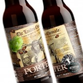
PRODUCTION / REALIZATION TECHNOLOGY: Paper, offset printing SPECIFICATIONS / TECHNICAL PROPERTIES: Label: 220 x 110 mm TAGS: Porter, Beer, Flood, Lable, CUBA Creative Branding Studio, Design RESEARCH ABSTRACT: Having analyzed the historical sources, in the studio decided to portray the consequences of the accident (London Beer Flood in London) on the label – however, in a light and ironic manner. These events were covered in all printed publications of the time, therefore, we decided to use the newspaper article about the event in The London Chronicle, as well as images of beer vat fragments and beer components – black malt and hops - as core design elements. CHALLENGE: The main objective was not to cross the line between light and ironic, positive and appealing design and the risk of inducing negative emotions in consumers. The surveys have shown that the design captured the essence of the historical events with confidence and irony, as well as revealed the nature of the historic beverage based on the recipes of that time. ADDED DATE: 2015-02-18 08:15:30 TEAM MEMBERS (3) : Evgeny Dyakonov, Cuba Creative Branding Studio and IMAGE CREDITS: Evgeny Dyakonov, 2014. |
||||
| Visit the following page to learn more: http://goo.gl/m0upED | |||||
| AWARD DETAILS | |
 |
Beer Flood Porter Label by Evgeny Dyakonov is Winner in Packaging Design Category, 2014 - 2015.· Read the interview with designer Evgeny Dyakonov for design Beer Flood Porter here.· Press Members: Login or Register to request an exclusive interview with Evgeny Dyakonov. · Click here to register inorder to view the profile and other works by Evgeny Dyakonov. |
| SOCIAL |
| + Add to Likes / Favorites | Send to My Email | Comment | Testimonials | View Press-Release | Press Kit |
Did you like Evgeny Dyakonov's Packaging Design?
You will most likely enjoy other award winning packaging design as well.
Click here to view more Award Winning Packaging Design.


