Rook Corporate Identity by Manos Siganos |
Home > Winners > #38563 |
 |
|
||||
| DESIGN DETAILS | |||||
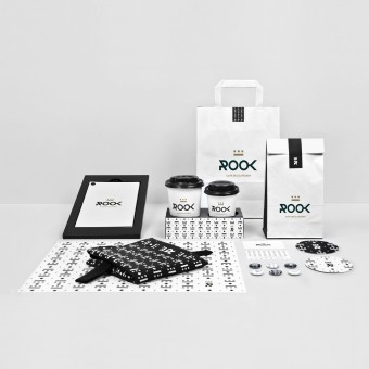
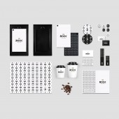
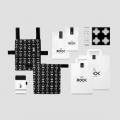
| DESIGN NAME: Rook PRIMARY FUNCTION: Corporate Identity INSPIRATION: The task of creating a visual identity that would involve selecting an appropriate name, designing the logo and applying it to the comprehensive corporate identity of a cafe was a truly fascinating challenge for me. I was even more thrilled when I was shown the drafts and became aware of the concept behind the design of both the interior and the exterior of the place in question. A thematic place as special as this deserved nothing less than a highly inspirational proposal. UNIQUE PROPERTIES / PROJECT DESCRIPTION: This project is about the corporate identity of a new Cafe-Delicatessen, the naming, the logo and its applications. The logo consists of the verbal section, namely ROOK, which typographically emphasizes the letter R in certain applications as a monogram and the symbol, rook-the chess tower itself- in minimal form. The colours are black, against a white background and gold. The main idea was to present the logo against a white background, with its dynamic, regardless of other elements. OPERATION / FLOW / INTERACTION: - PROJECT DURATION AND LOCATION: The project started in November 2013 and finished in June 2014 in Athens, Greece. The Cafe Delicatessen is located in Trikala, Greece. FITS BEST INTO CATEGORY: Graphics, Illustration and Visual Communication Design |
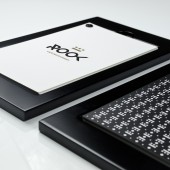
PRODUCTION / REALIZATION TECHNOLOGY: The materials used in the creation of the corporate identity were ecological papers with special textures, metallic offset colours and wood with a matte lacquer finish. Great care was generally taken to ensure an impeccable final result with attention paid to each and every detail, while the textures of the materials chosen ideally supplemented those of interior surfaces. SPECIFICATIONS / TECHNICAL PROPERTIES: The wooden base of the menu holder has a slot that allows the printed menu brochure to stand in place without falling, while the plastic screw binding of the menu brochure itself facilitates page replacement whenever this is necessary. The dimensions of the base are 18 x 30 cm, and those of the placemat and the menu card are 45 x 30 cm and 9.5 x 5.5 cm respectively, while the dimensions of the rest of the corporate identity are the conventional ones. TAGS: Corporate Identity, Logo, Cafe Visual Identity, Graphic Design RESEARCH ABSTRACT: The project first focused on the research for a suitable name for the cafe. We needed a name that would characterize the place, while at the same time being brief, pleasant-sounding and easy to remember. We conducted the above research taking account of two things: on the one hand, the names given to neoclassic buildings, villas, mansions, etc., and on the other hand, exactly what the image of the place seems to bring to mind. Having selected the name, we continued our research with the aim of designing the logo. We thus studied the architecture of towers and how it might be translated in terms of graphic design so as to take on a minimalistic, stylized form. The robustness, the dynamic and the strategic aspect were the dominant features that had to be conveyed through the image that would be created. Finally, the creation of the corporate identity necessitated suggestions concerning a the main requirements for the operation of a cafe delicatessen, and b its promotion demands, the combination of which would constitute this specific identity. Thus, great emphasis was given to the research for suitable cafe consumables, cloth materials, papers, etc., in order to select the best quality products that would represent a homogeneous corporate identity. CHALLENGE: The project design required research on modern typography. We had to design something modern to attract people of all age groups, and mainly young and middle-aged individuals with high aesthetic and gustatory standards. We used a particular well-designed, equal thickness, sans serif font, Neutraface, which is characterized by sharp edges following the pointed R. As far as the logo is concerned, all the lines and all the distances between them have the same thickness. ADDED DATE: 2015-02-04 09:41:14 TEAM MEMBERS (1) : Creative Director: Manos Siganos, Designer: Manos Siganos, Copywriter: Veatriki Sabatakou IMAGE CREDITS: Photos: George Fakaros, Architecture and Interior Design: BllendDesignOffice |
||||
| Visit the following page to learn more: http://www.manossiganos.com | |||||
| AWARD DETAILS | |
 |
Rook Corporate Identity by Manos Siganos is Winner in Graphics, Illustration and Visual Communication Design Category, 2014 - 2015.· Read the interview with designer Manos Siganos for design Rook here.· Press Members: Login or Register to request an exclusive interview with Manos Siganos. · Click here to register inorder to view the profile and other works by Manos Siganos. |
| SOCIAL |
| + Add to Likes / Favorites | Send to My Email | Comment | Testimonials | View Press-Release | Press Kit |
Did you like Manos Siganos' Graphic Design?
You will most likely enjoy other award winning graphic design as well.
Click here to view more Award Winning Graphic Design.


