ThuongTra Tea Brand Logo Premium Tea Logo by Hiep Ha Dung |
Home > Winners > #38090 |
 |
|
||||
| DESIGN DETAILS | |||||
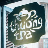
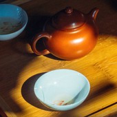
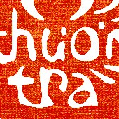
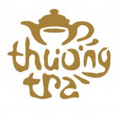
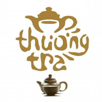
| DESIGN NAME: ThuongTra Tea Brand Logo PRIMARY FUNCTION: Premium Tea Logo INSPIRATION: Tea from Asian countries has quite different way of enjoying than that from Europe or America. It is more about well-being at soul and spirit than just taste or fashion. For Vietnamese market, most of tea logos/brands do not evoke correctly the quality products due to ill-studied and conservative designs. That's why Thuong Tra - a new brand of aged tea product - is movitvatedly designed with strong inspiration from organic visual solution. UNIQUE PROPERTIES / PROJECT DESCRIPTION: It's the first time negative space is used rationally to give new definition to logos for tea product by creating Logic and Organic visual solution, to best evoke a premium tea brand that produced manually from the most aged trees on remote highlands of Vietnam. OPERATION / FLOW / INTERACTION: The logo was designed together with the tea production because the designer had spent a lot of time studying the product, the story, the production to catch the spirit where the core values of vietnamese tea hidden. PROJECT DURATION AND LOCATION: During 2014 in the tea highlands of Vietnam. FITS BEST INTO CATEGORY: Graphics, Illustration and Visual Communication Design |
PRODUCTION / REALIZATION TECHNOLOGY: Negative Space is used for the very first time in this line of product. It integrated both a teapot and a teacup into one logo. Since asian tea focuses more on spirit, soul, space of drinking time, this technique will bring more abstract and profound feeling, which clearly portrait the value of the premium tea gathered from very aged trees on remote highlands. SPECIFICATIONS / TECHNICAL PROPERTIES: - TAGS: Tea, hand-made, aged-tree tea, traditional tea RESEARCH ABSTRACT: - Finding the general mistakes of tea logos already in the market - Dividing the mistakes into categories: concept, visual, legibility, readability, adaptability ... - Identifying the core personality traits of the new Thuong Tra Logo - Translating those traits into visual criteria and what should not be shaped - Prototyping, test, and the circles go on for serveral times - Official logo refinement and adaption. CHALLENGE: Due to the conservative character of long-aged product, there are not many tea brand owners accept the innovation of logo design or even brand researching activities. So the designer had to be on himself quite much to persuade the sponsor about the being right of designing a thoughtful logo, especially when his products are really premium and worth an excellent logo. ADDED DATE: 2014-12-28 16:10:03 TEAM MEMBERS (1) : IMAGE CREDITS: All images created by myself |
||||
| Visit the following page to learn more: http://thuongtra.com/ | |||||
| AWARD DETAILS | |
 |
Thuongtra Tea Brand Logo Premium Tea Logo by Hiep Ha Dung is Winner in Graphics, Illustration and Visual Communication Design Category, 2014 - 2015.· Read the interview with designer Hiep Ha Dung for design ThuongTra Tea Brand Logo here.· Press Members: Login or Register to request an exclusive interview with Hiep Ha Dung. · Click here to register inorder to view the profile and other works by Hiep Ha Dung. |
| SOCIAL |
| + Add to Likes / Favorites | Send to My Email | Comment | Testimonials | View Press-Release | Press Kit |
Did you like Hiep Ha Dung's Graphic Design?
You will most likely enjoy other award winning graphic design as well.
Click here to view more Award Winning Graphic Design.


