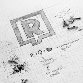
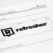
refresher.sk Logo by Miro Kozel |
Home > Winners > #36463 |
| CLIENT/STUDIO/BRAND DETAILS | |
 |
NAME: refresher.sk PROFILE: Most popular lifestyle portal in Slovakia and Czech Republic. Page was founded in 2011 and thanks to its innovative policy is now enjoying great popularity among fans and users of social networks. We create content for everyone, every day of the need to obtain new and interesting information on all aspects of life fresh man - that music, fashion, film, art, sports and generally active lifestyle. Page was founded in 2011 and thanks to its innovative policy is now enjoying great popularity among fans and users of social networks. Editing Refresher is a team of young and creative people who managed over three years with its humor, informal style of writing articles and selection of interesting topics, create a refresher of the most widely read online magazine for young people in Slovakia and the Czech Republic. The result is not only a site with high traffic, but real, valuable and authentic brand which young people believe. |
| AWARD DETAILS | |
 |
Refresher.sk Logo by Miro Kozel is Winner in Graphics, Illustration and Visual Communication Design Category, 2014 - 2015.· Read the interview with designer Miro Kozel for design refresher.sk here.· Press Members: Login or Register to request an exclusive interview with Miro Kozel. · Click here to register inorder to view the profile and other works by Miro Kozel. |
| SOCIAL |
| + Add to Likes / Favorites | Send to My Email | Comment | Testimonials | View Press-Release | Press Kit |
Did you like Miro Kozel's Graphic Design?
You will most likely enjoy other award winning graphic design as well.
Click here to view more Award Winning Graphic Design.


