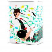
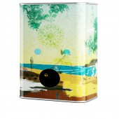
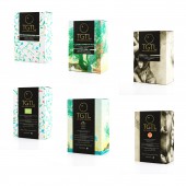
TGTL ALENTEJO COLLECTION Olive Oil Can by Guilherme Jardim & Pedro Messias |
Home > Winners > #35164 |
 |
|
||||
| DESIGN DETAILS | |||||
| DESIGN NAME: TGTL ALENTEJO COLLECTION PRIMARY FUNCTION: Olive Oil Can INSPIRATION: Portuguese culture, old olive oil workers and vests from "Alentejanos&qu UNIQUE PROPERTIES / PROJECT DESCRIPTION: Ilustrations that give us the nature values of the portuguese country and their culture and olive oil tradition. The singular design, not so much seen in olive oil can. Their are so beautiful, the people will keep it for home decoration or give them a second life, full filing with more olive oils, other liquid or simply with a flower inside. OPERATION / FLOW / INTERACTION: Operated by hand, you just pull the cap and open the can. The can is better then the bottle for olive oil, because it protects from directly natural light and does not drip. The can also as a small edge on top, and retain the olive oil that come from the cap. PROJECT DURATION AND LOCATION: This project was designed in 2012 in Lisbon -Portugal and kept in the shelfe during this period. FITS BEST INTO CATEGORY: Packaging Design |
PRODUCTION / REALIZATION TECHNOLOGY: Aluminium, Flandres metal sheet. Cardboard box. SPECIFICATIONS / TECHNICAL PROPERTIES: Flandres sheet/ (W x D X H) 60mm x13mm x87 mm/ Metal can. TAGS: (Illustration), (gift), (olive oil), (Collection), (Olive Oil), (Alentejo), (Design Tin´s) RESEARCH ABSTRACT: This project is a continuation of TGTL collection of olive oil can´s. They their business quite fast, with the first can´s collection. We start a research next to consumers and friends, that like to buy and collect the can´s. There was a need to have a portuguese collection for olive oil. We start thinking in wich is the most important region in olive oil in Portugal and what was the most significant concepts and traditions they like to promote. The answer was the people, the coast/weather and tradition in the Alentejanos vests. After this we incite three ilustrators to give us three different perspectives of the project and main goal. The result are quite diferente from each other, but at the same time it represents the diversity of the country and Alentejo region. CHALLENGE: The main obstacules was mix the ilustrations and design of the labels with the nutrition chart and info (by law) for consumer, trying to keep a flow and clean design. ADDED DATE: 2014-06-07 09:26:13 TEAM MEMBERS (1) : Pedro Messias, Guilherme Jardim, Pedro André, Fábio Chino, André da Loba, Carlos Quitério, Vladimir Pospelov. IMAGE CREDITS: Vladimir Pospelov all 3Dimages |
||||
| Visit the following page to learn more: https://tastelocal.prosite.com | |||||
| AWARD DETAILS | |
 |
Tgtl Alentejo Collection Olive Oil Can by Guilherme Jardim & Pedro Messias is Winner in Packaging Design Category, 2014 - 2015.· Read the interview with designer Guilherme Jardim & Pedro Messias for design TGTL ALENTEJO COLLECTION here.· Press Members: Login or Register to request an exclusive interview with Guilherme Jardim & Pedro Messias. · Click here to register inorder to view the profile and other works by Guilherme Jardim & Pedro Messias. |
| SOCIAL |
| + Add to Likes / Favorites | Send to My Email | Comment | Testimonials | View Press-Release | Press Kit |
Did you like Guilherme Jardim & Pedro Messias' Packaging Design?
You will most likely enjoy other award winning packaging design as well.
Click here to view more Award Winning Packaging Design.


