Balta Conceptual font by Migle Vasiliauskaite |
Home > Winners > #33014 |
 |
|
||||
| DESIGN DETAILS | |||||
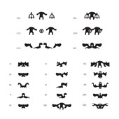
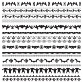
| DESIGN NAME: Balta PRIMARY FUNCTION: Conceptual font INSPIRATION: Nowadays the visual noise is all around us. Various medias mixing all together create hybridized visual reality. I wanted to participate in this process creating something that has a strong basis but also works in todays environment. Font BALTA was inspired by ancient Baltic jewelry designs. I wanted to use forms based on historical artifacts but at the same time my aim was to modernize them and bring them back to todays world trough other media - the font. UNIQUE PROPERTIES / PROJECT DESCRIPTION: Balta is a dingbat font which is based on symbols and patterns found on ancient Baltic jewelry. The font serves as a design inspiration and is created to implement various design ideas: it is designed with a special kerning allowing different letter combinations to form new letters-hybrids, which connect into intriguing pattern designs. The primary feature of the font BALTA is its duality: when writing with spaces between glyphs we get separated symbols, meanwhile writing without spaces creates hybrids of the same or different symbols. OPERATION / FLOW / INTERACTION: When writing with spaces between glyphs we get separated baltic symbols, meanwhile writing without spaces creates hybrids of two the same or different symbols. This lets us to create different variations of patterns depending on size, symbol combinations we choose. PROJECT DURATION AND LOCATION: The project started in 2011 in Milan, Italy and continues in Vilnius, Lithuania till today as I am continuously getting new ideas of what can be improved. FITS BEST INTO CATEGORY: Graphics, Illustration and Visual Communication Design |
PRODUCTION / REALIZATION TECHNOLOGY: As the forms were based on symbols and patterns found on ancient Baltic jewelry firstly I did a long research of jewelry types. The I chose a variety of symbols and signs that would be different enough but at the same time would create a harmony interacting with each other. SPECIFICATIONS / TECHNICAL PROPERTIES: Balta is produced in .ttf format. It has 100 glyphs. TAGS: baltic symbols, font, hybrid, symbol combination, pattern, baltic, symbol RESEARCH ABSTRACT: - CHALLENGE: While designing the font the most challenging part of the process was to choose final symbols that would have quite different forms but still in some way would connect good together. The hardest work was to find perfect connection point between each symbol when kerning the font. Actually, exactly because of this difficulty, this part was also very amazing - each time I found out some new possibilities of this font, a lot of new unexpected shapes and forms that were very inspiring. ADDED DATE: 2014-02-24 07:41:15 TEAM MEMBERS (1) : IMAGE CREDITS: Miglė Vasiliauskaitė |
||||
| Visit the following page to learn more: http://bit.ly/1fjI0EF | |||||
| CLIENT/STUDIO/BRAND DETAILS | |
 |
NAME: BALTA PROFILE: Conceptual font inspired by ancient Baltic jewelry designs. |
| AWARD DETAILS | |
 |
Balta Conceptual Font by Migle Vasiliauskaite is Winner in Graphics, Illustration and Visual Communication Design Category, 2013 - 2014.· Read the interview with designer Migle Vasiliauskaite for design Balta here.· Press Members: Login or Register to request an exclusive interview with Migle Vasiliauskaite. · Click here to register inorder to view the profile and other works by Migle Vasiliauskaite. |
| SOCIAL |
| + Add to Likes / Favorites | Send to My Email | Comment | Testimonials | View Press-Release | Press Kit |
Did you like Migle Vasiliauskaite's Graphic Design?
You will most likely enjoy other award winning graphic design as well.
Click here to view more Award Winning Graphic Design.


