Thais Pepe - dermatology clinic Identity Visual Communication by Marcelo Lopes |
Home > Winners > #32861 |
 |
|
||||
| DESIGN DETAILS | |||||
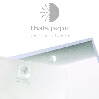
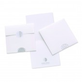
| DESIGN NAME: Thais Pepe - dermatology clinic PRIMARY FUNCTION: Identity Visual Communication INSPIRATION: The creation of the new brand was inspired by the following themes: male and female, fast peeling, skincare day and night, skin pores, transformation, molecular weight, molecule size, lightness, freshness, purity, gentleness, permeability, penetration, intra and intercellular, technology. Dermatology itself was also used for inspirational purposes. UNIQUE PROPERTIES / PROJECT DESCRIPTION: In addition to the creation of the new brand, the new project pursued exclusivity by means of the innovative concept in the development of the graphic work. Non-traditional material was added to the graphic process in order to provide a sophisticated visual language to the project, sharpen the senses and cause visual and tactile feelings and emotions. The project purpose was achieved thanks to the use of acrylic, grosgrain ribbons, relief printing with special textures, special dry cuts and laser cuts. OPERATION / FLOW / INTERACTION: One of the purposes of this project is to use our clients client to help promote the brand. Thanks to its high end material and the visual impact it causes, patients are likely to show the material received from the clinic to other people. PROJECT DURATION AND LOCATION: Project began in April 2013, and was completed in November, 2013. Project made available to the public at the dermatology clinic in São Paulo. FITS BEST INTO CATEGORY: Graphics, Illustration and Visual Communication Design |
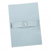
PRODUCTION / REALIZATION TECHNOLOGY: Graphic material entirely produced with fine paper, dry cut from the business card to the writing paper. Graphic resources include acrylic, grosgrain ribbon, laser cut and relief metallic printing. SPECIFICATIONS / TECHNICAL PROPERTIES: Different stationary formats were used in this project, including generally accepted formats in the industry, such as the business card size, and innovative designs. This project stands out not for the size of the pieces, but for the dry-cut and printing of the writing paper. Despite the plateau print on one writing paper and the dry cut on the other, both were developed to be printed by digital printers, and to ensure great printing results, even though the material will be printed at the dermatology clinic. TAGS: design, interactive, sensorial, ludic, sensorial design, emotion design, transforming emotion into design, marcelo lopes designer, stationery, brasil, São Paulo RESEARCH ABSTRACT: The aforementioned themes were used as inspiration to create a new brand. The project and production process included the research of materials that could be used together with paper such as the use of acrylic, laser corrosion, silkscreen printing and details such as the grosgrain ribbon upon the folder. The research on the paper to be used also involved finding special textures that remind one of the skin, to provide the project with greater sensorial experiences. CHALLENGE: The hardest part of this project was the challenge involved in the printing process, together with the dry cut and laser cut, especially in order to achieve greater accuracy on the dry cut for the brand not to be decentralized within the round cut. ADDED DATE: 2014-02-21 06:22:49 TEAM MEMBERS (1) : Marcelo Lopes IMAGE CREDITS: Marcelo Lopes, 2013. |
||||
| Visit the following page to learn more: http://merchan-design.com.br | |||||
| AWARD DETAILS | |
 |
Thais Pepe-Dermatology Clinic Identity Visual Communication by Marcelo Lopes is Winner in Graphics, Illustration and Visual Communication Design Category, 2013 - 2014.· Read the interview with designer Marcelo Lopes for design Thais Pepe - dermatology clinic here.· Press Members: Login or Register to request an exclusive interview with Marcelo Lopes. · Click here to register inorder to view the profile and other works by Marcelo Lopes. |
| SOCIAL |
| + Add to Likes / Favorites | Send to My Email | Comment | Testimonials | View Press-Release | Press Kit |
Did you like Marcelo Lopes' Graphic Design?
You will most likely enjoy other award winning graphic design as well.
Click here to view more Award Winning Graphic Design.


