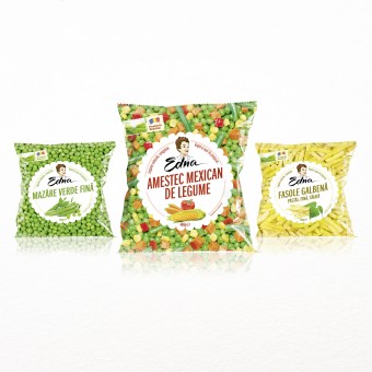
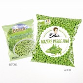
Edna Frozen Vegetables Packaging Design Range by AMPRO DESIGN |
Home > Winners > #32107 |
| CLIENT/STUDIO/BRAND DETAILS | |
 |
NAME: Frigorifer PROFILE: Frigorifer SA is located inside the city of Tulcea, on the bank of the Danube River. It has an impressive storage capacity of 16.000 tons that makes it the largest cols store in the South Eastern Europe and a 30.000 sqm built area on a 50.000 sqm land. As it has direct access to the Danube Delta, Frigorifer has its own deck where vessels of maximum 5.000 metric tons can be landed and charged. Moreover it is fitted with an internal rail infrastructure that enables wagons loading and unloading |
| AWARD DETAILS | |
 |
Edna Frozen Vegetables Packaging Design Range by Ampro Design is Winner in Packaging Design Category, 2013 - 2014.· Read the interview with designer AMPRO DESIGN for design Edna here.· Press Members: Login or Register to request an exclusive interview with AMPRO DESIGN . · Click here to register inorder to view the profile and other works by AMPRO DESIGN . |
| SOCIAL |
| + Add to Likes / Favorites | Send to My Email | Comment | Testimonials | View Press-Release | Press Kit |
Did you like Ampro Design's Packaging Design?
You will most likely enjoy other award winning packaging design as well.
Click here to view more Award Winning Packaging Design.


