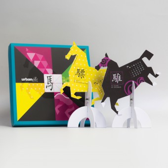
2014 The Year of Horse Calendar Design Creative desktop calendar by Ng Wai Ming Chris |
Home > Winners > #32020 |
 |
|
||||
| DESIGN DETAILS | |||||
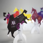
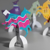
| DESIGN NAME: 2014 The Year of Horse Calendar Design PRIMARY FUNCTION: Creative desktop calendar INSPIRATION: As the year of horse 2014 was approaching, we aimed to produce a creative corporate gift for our clients. Then we came up with the idea of using the horse to produce a desktop calendar, which is functional yet meaningful to tie-in the theme with the year of horse. To enhance the visual impact, we designed 12 horses with eye-catching colors and shapes. We also introduced 12 meaningful Chinese characters representing different horse type for the character, which demonstrates the profound Chinese culture in a creative way. UNIQUE PROPERTIES / PROJECT DESCRIPTION: 2014 is the year of horse in Chinese culture. This creative desktop calendar features a series of 12 horses representing 12 distinctive Chinese characters. Each Chinese character has a special meaning and represents a unique type of horse with exclusive color and characteristics. With the creative paper structure and the eye-catching designed horse this calendar can be an interesting display in your office or at home. May wish this calendar will bring prosperity, good health and many good fortunes to the recipients throughout the year. OPERATION / FLOW / INTERACTION: When the year of horse was approaching, our design team came up with an idea of making a desktop calendar under the theme of "horse". In the brainstorming stage we focused on how to create the form of a horse and we had lots of ideas and sketches of different types of paper horse structure, while most of them were quite complicated and hard-to-produce technically. Then we tried to modify our design and to develop an easy-to-assemble stand structure, which people could set up the calendar in less than 10 seconds. After that, our next step was the creative theme to design the horses. We did a lot of research about horses, such as their form, colours and source of origins. We found on interesting facts from the Chinese dictionary that there were particular words that describing horses with different colors and patterns, therefore we picked 12 Chinese characters, and adopted them into our calendar design and it worked very well. When it came to the production stage, we encountered some challenges in the development of the horse shapes. Due to some technical limitation of the die-cut method, we modified the horses’ shapes until we finalized with the relatively simplified yet dynamic form of horses. We were quite satisfied with the final product and our clients were impressed with this New Year gift from our company. PROJECT DURATION AND LOCATION: The project started in November 2013 and finished in December 2013 in Hong Kong. FITS BEST INTO CATEGORY: Graphics, Illustration and Visual Communication Design |
PRODUCTION / REALIZATION TECHNOLOGY: A combination of art paper and wood free paper has been used for this desktop calendar production. The 6 different die-cut shapes of horses were made up of 2mm thick cardboard. A customized design structure of the stand makes it easy-to-assemble. SPECIFICATIONS / TECHNICAL PROPERTIES: Width 152mm x Depth 152mm x Height 26mm TAGS: design, graphic, calendar, creative calendar, promotion item RESEARCH ABSTRACT: We would like to adopt the tradition Chinese culture into our design in this project, therefore in the research stage we searched through Chinese history, The Book of Changes ("I Chin"), the Ancient Chinese military guide book, Chinese poem, paintings , songs and many other books. Finally we got what we want in the Chinese dictionary. We also did a lot of online research to study the form of the horse, the paper structure and some information was our inspirational source in design direction. We got many positive feedbacks from our clients, saying that it was quite fun with a calendar that they can actually use it, display it and can also learn something from it- the 12 characters and the corresponding color and pattern of the horses. CHALLENGE: We found that it was quite difficult to adapt the tradition Chinese cultural elements into our design. It was because most of the elements have strong visual identities that are not easy to mix with modern design philosophy. Therefore we put a lot of effort in choosing a suitable cultural element that can transform into an attractive visual. Luckily, we found and picked the 12 Chinese characters in the Chinese dictionary that delivered the message very well and made us achieved our goal. We also tried very hard in developing the calendar structure. There were rounds of modifications, from a complicated form into a simple structure, and to a more user-friendly structure. Our team enjoyed very much in this design project and our clients were satisfied with the outcome. We are so proud that our design will stay on someone’s desktop. May wish this calendar will bring prosperity, good health and many good fortunes to the recipients throughout the year. ADDED DATE: 2014-01-23 00:18:08 TEAM MEMBERS (5) : Ng Wai Ming Chris (Creative Director), Sin King Man Kelly (Project Manager), Or Chi Bun Stanley (Art Director), So Sheung Man Clement (Senior Designer) and Urban Air Design Ltd (Design Consultant) IMAGE CREDITS: Sophotography |
||||
| Visit the following page to learn more: http://www.urbanairdesign.com/ | |||||
| AWARD DETAILS | |
 |
2014 The Year of Horse Calendar Design Creative Desktop Calendar by Ng Wai Ming Chris is Winner in Graphics, Illustration and Visual Communication Design Category, 2013 - 2014.· Read the interview with designer Ng Wai Ming Chris for design 2014 The Year of Horse Calendar Design here.· Press Members: Login or Register to request an exclusive interview with Ng Wai Ming Chris. · Click here to register inorder to view the profile and other works by Ng Wai Ming Chris. |
| SOCIAL |
| + Add to Likes / Favorites | Send to My Email | Comment | Testimonials | View Press-Release | Press Kit |
Did you like Ng Wai Ming Chris' Graphic Design?
You will most likely enjoy other award winning graphic design as well.
Click here to view more Award Winning Graphic Design.


