Office Interior of Mundipharma Singapore Office Interiors by Priscilla Lee Pui Kee |
Home > Winners > #31874 |
 |
|
||||
| DESIGN DETAILS | |||||
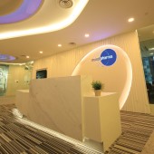
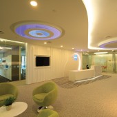
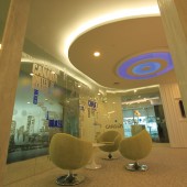
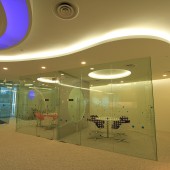
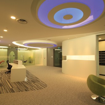
| DESIGN NAME: Office Interior of Mundipharma Singapore PRIMARY FUNCTION: Office Interiors INSPIRATION: Static Movement UNIQUE PROPERTIES / PROJECT DESCRIPTION: White dominates the whole concept in this design. With the combination of a diverse array of geometrical shapes within this space, the entire section fuses seamlessly to create a certain unique movement. Coupled with the grand circular design of the ceiling, which dominates the ceiling, they form the core of this design. The round blue lighting, a symbolic representation of the client’s logo, enhances the company image and cleverly blending with the entire space, as if rippling outwards to signify constant growth. And through the use of different textured materials, the movement is hugely amplified. Floor carpets with irregular black and white lines, add fluidity to the large white reception counter, like a flying chariot. OPERATION / FLOW / INTERACTION: - PROJECT DURATION AND LOCATION: Completed in December 2013, Asia Square Tower 2, Singapore FITS BEST INTO CATEGORY: Interior Space and Exhibition Design |
PRODUCTION / REALIZATION TECHNOLOGY: Material : Clear Glass, Marble, Carpet, White Spray Painting & Wallpaper SPECIFICATIONS / TECHNICAL PROPERTIES: Est 17,500 sq ft TAGS: Apcon Interior Design, Reception Area, Waiting Area, Static Movement RESEARCH ABSTRACT: Research was done based on Principles of Design to organize lines, shapes, forms and colours into a given space. Designer is to create objects with elements of movement to bring life to the static space. CHALLENGE: To blend multiple elements into a given space without being obtrusive. ADDED DATE: 2014-01-10 02:16:56 TEAM MEMBERS (2) : Priscilla Lee Pui Kee and Apcon Pte Ltd IMAGE CREDITS: Apcon Pte Ltd, 2014 |
||||
| Visit the following page to learn more: http://www.apcon.com.sg | |||||
| AWARD DETAILS | |
 |
Office Interior of Mundipharma Singapore Office Interiors by Priscilla Lee Pui Kee is Winner in Interior Space and Exhibition Design Category, 2013 - 2014.· Read the interview with designer Priscilla Lee Pui Kee for design Office Interior of Mundipharma Singapore here.· Press Members: Login or Register to request an exclusive interview with Priscilla Lee Pui Kee . · Click here to register inorder to view the profile and other works by Priscilla Lee Pui Kee . |
| SOCIAL |
| + Add to Likes / Favorites | Send to My Email | Comment | Testimonials | View Press-Release | Press Kit | Translations |
Did you like Priscilla Lee Pui Kee's Interior Design?
You will most likely enjoy other award winning interior design as well.
Click here to view more Award Winning Interior Design.


