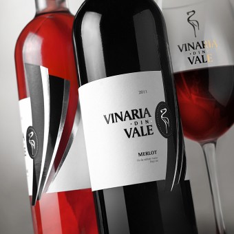
Vinaria din Vale Series of quality wines by Valerii Sumilov |
Home > Winners > #30009 |
 |
|
||||
| DESIGN DETAILS | |||||
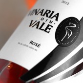
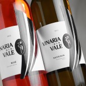
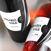
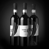
| DESIGN NAME: Vinaria din Vale PRIMARY FUNCTION: Series of quality wines INSPIRATION: The developed trademark has served as the main element for the product's label design. The main intent for such a solution was to draw more attention to the market's newcomer and make its name more recognizable. Another important element of the design is the image of stylized feathers coming from the stork's wing. This splashy element has become one of the most prominent features of the company's entire range of products, which serves very well in terms of product distinction among the competitors. UNIQUE PROPERTIES / PROJECT DESCRIPTION: The main task was to rebrand and launch a new trademark Vinaria din Vale. The main peculiarity of this project was keeping the original name as well as the main image of the company - the silhouette of a stork. Besides, the design had to outline the national and regional lineage of the product. At the same time there was also a request to position the product among quality, status wines for successful and modern consumers. OPERATION / FLOW / INTERACTION: This is a unique label for an exclusive wine, which will only be distributed through the HoReCa system. The label's main task is to outline the product from the rest of wines of the same category and make consumer remember it as something original, interesting and unusual. While working on the design, I was thinking about how the consumer sitting in the restaurant will be looking at the label, will take the bottle and be surprised after looking at it at a closer distance. PROJECT DURATION AND LOCATION: The project was initiated in February 2013 and sent to the printing house in April 2013. Currently the wine is available only in select restaurants in Chisinau. FITS BEST INTO CATEGORY: Packaging Design |
PRODUCTION / REALIZATION TECHNOLOGY: The printing process involved such post-printing techniques as foil stamping and the use of tactile varnish. Artistic matte paper was chosen as the base for the label. SPECIFICATIONS / TECHNICAL PROPERTIES: The label is glued around the bottle's entire circumference thus forming a continuous line TAGS: Wine, Valerii, Sumilov, packaging design, labels design RESEARCH ABSTRACT: This project took a lot of time to be finished. While it looks rather simple, temperately design and limited in its color scheme, the project represented a very hard task, since a lot of things were at stake: the winemaker's reputation, the customer's expectations, the designer's professionalism. CHALLENGE: The most difficult thing about the entire project was understanding the bulk of responsibility associated with it. Creating a modest design, reflecting the high quality of the product, keeping the continuity with the previous products from the same winemaker, reflecting the product name's essence and confirming own professional qualification – these were the hardest things about this project. ADDED DATE: 2013-09-10 01:36:50 TEAM MEMBERS (1) : Valerii Sumilov, Irina Strashnic, Chisinau, Moldova IMAGE CREDITS: mage #No1: Kirill Zmurciuk, 2013. Image #No2: Kirill Zmurciuk, 2013. Image #No3: Kirill Zmurciuk, 2013. Image #No4: Kirill Zmurciuk, 2013. Image #No5: Kirill Zmurciuk, 2013. |
||||
| Visit the following page to learn more: https://www.shumilovedesign.eu | |||||
| AWARD DETAILS | |
 |
Vinaria Din Vale Series of Quality Wines by Valerii Sumilov is Winner in Packaging Design Category, 2013 - 2014.· Read the interview with designer Valerii Sumilov for design Vinaria din Vale here.· Press Members: Login or Register to request an exclusive interview with Valerii Sumilov. · Click here to register inorder to view the profile and other works by Valerii Sumilov. |
| SOCIAL |
| + Add to Likes / Favorites | Send to My Email | Comment | Testimonials | View Press-Release | Press Kit |
Did you like Valerii Sumilov's Packaging Design?
You will most likely enjoy other award winning packaging design as well.
Click here to view more Award Winning Packaging Design.


