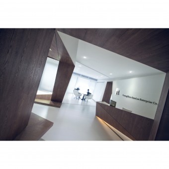
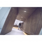
Samlee Office Office Space by Yong Cai Huang |
Home > Winners > #29641 |
 |
|
||||
| DESIGN DETAILS | |||||
| DESIGN NAME: Samlee Office PRIMARY FUNCTION: Office Space INSPIRATION: Minimalism the city metabolism Cubism,Overlaying and infiltrating The oriental aesthetics of opening, developing, changing and concluding UNIQUE PROPERTIES / PROJECT DESCRIPTION: Samlee Office was designed by minimalism from the city metabolism. the project presents the interactive relationship between the city, work and people ;a kind of intimately relation of activity and inertia; transparent overlay; permeation blank. The core line the people flow in it, corresponds to the of opening, developing, changing and concluding. The twist centre line through up all the function area. A special blank-leaving, with the triangle transparent fold line, build up a four- dimensional binary relations between people and time. OPERATION / FLOW / INTERACTION: The main theory of this layout is running through the three original architect units. The concept breaks the original formalistic space, but assembles the public area, opened-up office, and semi-enclosed office organically. From dynamic to quiescence, the users move in a streamlined plane and fold lined elevation, presents the ambiguous and communicated interior space. PROJECT DURATION AND LOCATION: The project started in June 2012Guangzhou, China and finished in November 2012 in Guangzhou, China FITS BEST INTO CATEGORY: Interior Space and Exhibition Design |
PRODUCTION / REALIZATION TECHNOLOGY: The main materials of the project: Chinese Ash (fraxinus mandshurica), enhanced composite wood floor, ultra clear glass, frosted stainless steel SPECIFICATIONS / TECHNICAL PROPERTIES: 480 m2 The main theory of this layout is running through the three original architect units. The concept breaks the original formalistic space, but assembles the public area, opened-up office, and semi-enclosed office organically. From dynamic to quiescence, the users move in a streamlined plane and fold lined elevation, presents the ambiguous and communicated interior space. TAGS: Overlaying and infiltrating RESEARCH ABSTRACT: This project is a result of extending minimalism from the city metabolism. The ‘core line’ just like a meandering river, the people flow in it, corresponds to the oriental aesthetics of ‘opening, developing, changing and concluding’. The twist centre line through up all the function area. A special ‘blank-leaving’, with the triangle transparent fold line, overlaying and infiltrating the space, build up a four- dimensional binary relations between people and time. CHALLENGE: In the original three separate interior frame, designed to look like random channel line, in fact, is the result of the designer based on customer requirements to provide basic functionality to make careful arrangements tight, people walking on this path, depending on the domain with the "penetration "" overlay "," ambiguous "fun. ADDED DATE: 2013-07-10 06:12:14 TEAM MEMBERS (2) : Yong Cai Huang and Li Dong Cai IMAGE CREDITS: Yong Cai Huang, 2013. |
||||
| Visit the following page to learn more: http://mixinfo.id-china.com.cn/a-12488-1 |
|||||
| AWARD DETAILS | |
 |
Samlee Office Office Space by Yong Cai Huang is Winner in Interior Space and Exhibition Design Category, 2013 - 2014.· Read the interview with designer Yong Cai Huang for design Samlee Office here.· Press Members: Login or Register to request an exclusive interview with Yong Cai Huang. · Click here to register inorder to view the profile and other works by Yong Cai Huang. |
| SOCIAL |
| + Add to Likes / Favorites | Send to My Email | Comment | Testimonials | View Press-Release | Press Kit | Translations |
Did you like Yong Cai Huang's Interior Design?
You will most likely enjoy other award winning interior design as well.
Click here to view more Award Winning Interior Design.


