DESIGN NAME:
Glow
PRIMARY FUNCTION:
Print Ad
INSPIRATION:
Nescafe Decaf targets Adult Urban dwellers who are daily drinkers of Nescafe classic. They drink their coffee at in the morning for stimulation and don't drink coffee at night as they won't be able to sleep. The aim of the WHY NOT? campaign is to encourage readers to enjoy Nescafe Decaf in the evenings. The Inspiration for the project came from star-shaped glow-in-the-dark wall stickers in children's bedrooms, which glows when lights are turned off.
UNIQUE PROPERTIES / PROJECT DESCRIPTION:
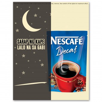
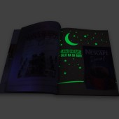
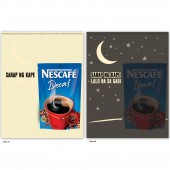
This material was published back in 2010 as part of Nescafe Decaf’s WHY NOT? Campaign. It is the first glow in the dark magazine ad ever produced on print. Its aim is to encourage readers to enjoy Nescafe Decaf in the evenings. In a lit room, the material shows a Nescafe Decaf pack with the headline- SARAP NG KAPE. Translates to GREAT TASTING COFFEE. When lights are turned off, the moon and stars glow along the new copy that reads SARAP NG KAPE, LALO NA SA GABI! Translates to GREAT TASTING COFFEE, ESPECIALLY AT NIGHT!
OPERATION / FLOW / INTERACTION:
In a lit room, the material shows a Nescafe Decaf pack with the headline: SARAP NG KAPE (Great Tasting Coffee) When lights are turned off, the moon and stars glow along the new copy that reads: SARAP NG KAPE...LALO NA SA GABI! (Great Tasting Coffee...especially at night!)
PROJECT DURATION AND LOCATION:
The Project started October 2010 and was published in December 2010
FITS BEST INTO CATEGORY:
Graphics, Illustration and Visual Communication Design
|
PRODUCTION / REALIZATION TECHNOLOGY:
The whole project started from the client's brief to create a special execution print ad for Nescafe Decaf WHY NOT? Campaign, to be published exclusively within Summit Media titles. The Big Idea: READING A PRINT AD WITH NO LIGHTS. WHY NOT? The Inspiration: Glow-in-the-dark stickers in children's bedroom. The Execution: The Nescafe Decaf was printed with glow-in-the-dark colors. In a lit room, the material shows a Nescafe Decaf pack with the headline- SARAP NG KAPE. Translates to GREAT TASTING COFFEE. When lights are turned off, the moon and stars glow along the new copy that reads SARAP NG KAPE, LALO NA SA GABI! Translates to GREAT TASTING COFFEE, ESPECIALLY AT NIGHT!
SPECIFICATIONS / TECHNICAL PROPERTIES:
Size: 8.5 x 11 inches Stock: C2S 140 Printing: Offset with Silk Screen for Glow in the Dark Ink
TAGS:
Print Ad, Interactive Print, Glow-in-the-dark, Creative Execution, Advertisement, Creative Design, Coffee, Nescafe, Decaf, Night, Magazine Ad
RESEARCH ABSTRACT:
The aim of the WHY NOT? campaign is to encourage readers to enjoy Nescafe Decaf in the evenings. The Inspiration for the project came from star-shaped glow-in-the-dark wall stickers in children's bedrooms, which glows when lights are turned off.
CHALLENGE:
Back in 2010, the print producers found it hard to find printers that can print with glow-in-the-dark ink.
ADDED DATE:
2013-02-28 11:01:59
TEAM MEMBERS (1) :
Publication: Summit Media, Editor-in-Chief: Dondi Limgenco, Art Director: John Vincent Redrico, Managing Editor: Iza Santos and Key Account Specialist: Alex Revelar
IMAGE CREDITS:
John Vincent Redrico, 2012.
|
