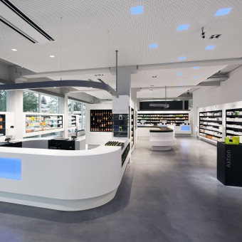
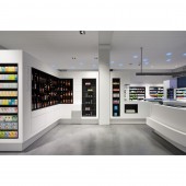
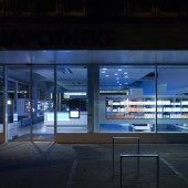
Jordan Apotheke Indoor Lighting by Conceptlicht GmbH |
Home > Winners > #27873 |
| CLIENT/STUDIO/BRAND DETAILS | |
 |
NAME: Conceptlicht GmbH PROFILE: We are perception planners! Founded in 1990 by Helmut Angerer, Conceptlicht is a lighting design office that plans and realizes lighting design projects all over the world. Our approach to lighting design is the connection of visual perception and the impact of light on humans with architectural aspects in respect of technical regulations. Our goal is to create comfortable atmospheres. Consequently, the aim is not to reach a certain amount of light, but rather to translate the desired perception of space into lighting design. In the end, lighting design is the design of the perceptual image. It is essential that the hierarchy of spatial elements is supported by light, creating a corresponding hierarchy of luminance dependent on functional and esthetical aspects. Conceptlicht consists of seven lighting designers with different backgrounds: architecture, interior design, electrical engineering and scenography. |
| AWARD DETAILS | |
 |
Jordan Apotheke Indoor Lighting by Conceptlicht Gmbh is Winner in Lighting Products and Fixtures Design Category, 2012 - 2013.· Read the interview with designer Conceptlicht GmbH for design Jordan Apotheke here.· Press Members: Login or Register to request an exclusive interview with Conceptlicht GmbH. · Click here to register inorder to view the profile and other works by Conceptlicht GmbH. |
| SOCIAL |
| + Add to Likes / Favorites | Send to My Email | Comment | Testimonials | View Press-Release | Press Kit | Translations |
Did you like Conceptlicht Gmbh's Lighting Design?
You will most likely enjoy other award winning lighting design as well.
Click here to view more Award Winning Lighting Design.


