Caesar Park Hotels and Resorts Design Strategy by Marcelo Lopes Design |
Home > Winners > #27715 |
 |
|
||||
| DESIGN DETAILS | |||||
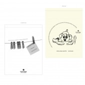
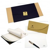
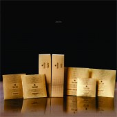
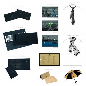
| DESIGN NAME: Caesar Park Hotels and Resorts PRIMARY FUNCTION: Design Strategy INSPIRATION: The items were studied to deliver the guests a design “ experience”. The sensitivy, playfulness, coziness, even the basic items are presented in a more innovative way. A project that we wanted the guests to feel embraced by the hotel. The unique design and communication of the items were created to goal a generating greater recall for the guest of their stay. A design interfering people’s day-to-day in a positive way. UNIQUE PROPERTIES / PROJECT DESCRIPTION: The principal points of this project were to give the overall economy: fifty per cent reduction in the number of items in the visual identity manual, less paper consumption. Creation of the new index structure to facilitate the search of the items in the new visual identity manual, durability - some support materials were also substituted with the aim of generating greater durability for the items and a sustainable Design, we replaced some plastic or TNT materials for hundred per cent cotton fabric. All paper specified in the new project are FSC certified papers. OPERATION / FLOW / INTERACTION: Optimization: With other twenty-five per cent the items with the corporate brand we finalized the project with seventy-five per cent of the new visual identity manual using the corporate brand, Caesar Park Hotels & Resorts. Now just twenty-five per cent of items need to be produced in smaller amount and per hotel. The remainder can go through the corporate purchasing dept. saving in printing costs, optimizing the purchasing dept. of each hotel and to ensure a better quality control of the items. PROJECT DURATION AND LOCATION: This project spend more then one year to be finished, and the use are for the hotel Caesar Park São Paulo – Faria Lima, Caesar Park São Paulo – International Airport, Caesar Park Rio de Janeiro – Ipanema and Caesar Park Buenos Aires. FITS BEST INTO CATEGORY: Graphics, Illustration and Visual Communication Design |
PRODUCTION / REALIZATION TECHNOLOGY: Most of the new design of the pieces was used paper, using plastic for a little of pieces, cotton fabric and post consumer recycled polypropylene. SPECIFICATIONS / TECHNICAL PROPERTIES: This project involved more then a hundred pieces with a new design using different sizes and material. TAGS: Hotels and resorts, strategic design, marcelo lopes design, branding, visual identity, emotional design, interactive design, ludic, brazil RESEARCH ABSTRACT: Reduction in paper consumption of pieces with ongoing (daily) replacements, and transfer of part of such savings to the menus pieces with sporadic replacements.Previou CHALLENGE: Reduction in the number of pieces of the visual identity manual: from two hundred twenty to one hundred and ten pieces. The size of practically all pieces maintained in the manual and the new pieces implemented were thoroughly studies with respect to use of paper, thereby rendering the project more sustainable. From the corporate responsibility standpoint and the pieces more delicate and elegant, from the perspective of design – pieces are more compatible with an upscale hotel. ADDED DATE: 2013-02-13 09:26:14 TEAM MEMBERS (1) : IMAGE CREDITS: Marcelo Lopes Design, 2012. |
||||
| Visit the following page to learn more: http://www.merchan-design.com.br | |||||
| AWARD DETAILS | |
 |
Caesar Park Hotels and Resorts Design Strategy by Marcelo Lopes Design is Winner in Graphics, Illustration and Visual Communication Design Category, 2012 - 2013.· Read the interview with designer Marcelo Lopes Design for design Caesar Park Hotels and Resorts here.· Press Members: Login or Register to request an exclusive interview with Marcelo Lopes Design. · Click here to register inorder to view the profile and other works by Marcelo Lopes Design. |
| SOCIAL |
| + Add to Likes / Favorites | Send to My Email | Comment | Testimonials | View Press-Release | Press Kit |
Did you like Marcelo Lopes Design's Graphic Design?
You will most likely enjoy other award winning graphic design as well.
Click here to view more Award Winning Graphic Design.


