DESIGN NAME:
ALDAR Headquarters
PRIMARY FUNCTION:
Office headquarters
INSPIRATION:
When challenged to create an iconic structure on Al Raha beach, MZ Architects decided to create a simple building that would possess the calm, ideal beauty of classical architecture while also having considerable expressive power, a building that would compete with the iconic architecture of the UAE and create a sense of place and identity for the area.
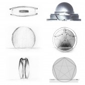
Inspired by the clam shell which has deep meaning for Abu Dhabi with its seafaring heritage, as well as the symbolism of the geometric round shape, the architects imagined two giant circular curved walls of glass mirroring an open clam shell. An extremely pure geometrical but daring design was born: a round skyscraper with a curved glass skin.
UNIQUE PROPERTIES / PROJECT DESCRIPTION:
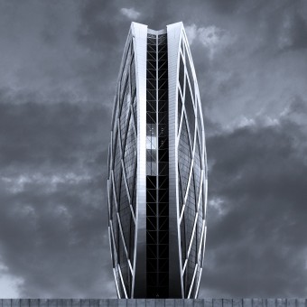
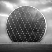
The Aldar Headquarters designed by MZ Architects has a distinctive and innovative design: a semispherical building comprising two circular convex shaped facades linked by a narrow band of indented glazing. This iconic fully glazed structure is completely circular in elevation and curved in all other directions.
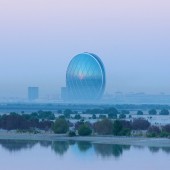
The circular skyscraper flaunts its form across the open waters and land, like a pearl resting on the sand shores. The architecture is understood from a distance and is equally impressive from both close range and afar. Its timeless geometry, symbol of perfection and infinity, holds a rich presence and brings with it new challenges of stability and structure.
Developing the concept, the ideas of simplicity, purity and learning from nature, were coupled with the reliance on one of the oldest rules of architecture: that of proportion. In fact to help MZ Architects bring their concept to life, the issue of stability proved to be a crucial one for the circular building. The architects took the challenge and elevated it by looking back at the idea of the cosmic body of the man in the circle and by inscribing the pentagram into the circular façade, they were able to locate the two points of stability; the two points where the building will meet the earth.
The complexities of simplicity indeed proved to be many, and the design of the HQ could only be a holistic one, merging architecture and structure. It became an object of both fields, showcasing the expansion and blurring of their respective limits in order to form a combined product.
Like many of nature’s creations, the building comes together by allowing each one of its elements to play a crucial role in its being and construction.
Unlike the conventional four sided buildings, the project challenges the approach to construction by questioning the typical roof structure. This three faceted building relies on its zipper-like element, a continuous glass and structural band that stitches the two main facets together, creating a slim continuous surface that is both vertical and horizontal, side and face, window and roof.
OPERATION / FLOW / INTERACTION:
The project was developed in line with the US Green Building Council LEED rating system. It is one of the first eco-friendly official buildings in Abu Dhabi, which is made up of recyclable kind of materials like steel, concrete and glass, and includes a district cooling plant, as well as efficient lighting and water systems. The building maximizes natural light, with meeting areas and offices spread around the perimeter of each floor. A subterranean automated vacuum waste collection system is also incorporated to reuse all the waste products of the building. The first of its kind in Abu Dhabi, the system sucks rubbish directly to a local waste transfer station for recycling and compacting.
This construction was completed by keeping the environmental factors in mind, now it is capable to achieve the lowest LEED silver rating award by US Green Building Council. The building's efficiency is classed as 82%, making it the most efficient design for the floor area.
PROJECT DURATION AND LOCATION:
Start date: Jan 2007
Completion date: Jan 2010
Location: Al Raha Beach, Abu Dhabi – United Arab Emirates
FITS BEST INTO CATEGORY:
Architecture, Building and Structure Design
|
PRODUCTION / REALIZATION TECHNOLOGY:
Just like a seashell, HQ’s morphology merged the idea of shape, sculpture and pattern into one unified and expressive whole. The curved glass skin became one of its most complex components to be executed in record time.
The HQ structure having a 25m cantilevered design in every longitudinal direction, concrete couldn’t be considered as construction material. A concrete structure would have required unwanted internal supports and entailed time-consuming and costly on-site construction work. Therefore, the team developed a complex external diamond-shaped steel structure, called a diagrid, which achieved the striking shape of the building. The first of its kind in the UAE, the diagrid allowed the creation of structural efficiency and stability appropriate to the circular building. The system not only helped minimize the impact of the steel frame on the façade but also served as an architectural element that blurred all sense of scale and inflated the structure, moving away from the typical horizontal stratification of the facades. This diagrid system eliminates the need for internal columns to support the building which would compromise the aesthetic appeal as well as the views from within. This improved the building's efficiency, providing layout flexibility for tenants.
The main facades were defined using a toroidal geometry cut by a cylinder to create the perfect circle in elevation. By using this form, each horizontal section through the façade is described by a circle of varying radii at different heights all with their centres along the same vertical axis.
SPECIFICATIONS / TECHNICAL PROPERTIES:
Plot area: 10,790 sqm
Total built-up area: 123,000 sam
Height to Architectural Top: 110m
Number of Floors Above Ground: 25
TAGS:
Circular skyscraper, Diagrid, Stability, Golden section, Headquarters, Sustainability
RESEARCH ABSTRACT:
The Circle symbolizes unity, stability, rationality. It is also the symbol of infinity, without beginning or end, perfection, the ultimate geometric symbol. It represents a completeness which encompasses all space and Time.
The Sphere, the 2-dimentional circle, is hailed by Etienne-Louis Boullée as the ideal and perfect form since no trick of perspective can alter its appearance .
Inspired by the symbolism of the Circle and the Sphere, architects have used the geometric round shape in their building designs since the beginning of time.
The circular shape of the tholos, the greek temple with a round ground plan rather than a square or rectangular one, is not unusual in Greek architecture and has also been used later on in the Roman building typology.
In 1784, Boullée conceived his most emblematic project: the Cenotaph for Isaac Newton which would have taken the form of an immense sphere 150 m high, mirroring the universe, and embedded in a circular base. This structure remained however a sketch and was never built.
Throughout the modern history of architecture, architects have also been designing and realizing circular-based buildings, round towers as well as domes and spheres used notably in the development of planetaria and theatres. The circular shape has always been used in the ground and floor plans with the traditional building elevation and roof.
However, no one has attempted to build a structure completely circular in elevation. Such an idea would normally be left on sketches.
CHALLENGE:
To bring the massive circular concept to life, the issues of visual stability, harmony and dynamism proved to be crucial. The real challenge of the façade was to find the two points where the building should pose on the ground – and for that, the development of the volume began by using one of the oldest rules in architecture: the rule of proportion based on the Golden Section.
The golden section is not merely an aesthetic proportion important to artists, but an omnipresent cosmic principle that induces structural differentiation. Indeed, this ratio appears in the works of nature (such as the human body, the bodies of animals, plants and crystals) and is naturally preferred by the human mind and eye. The proportions of the Greek temple reflect the pleasing aesthetic ratio of the golden section.
When applying the golden section ratio to the circular façade of the building, the circle was divided into a pentagram, on which the Human Body is juxtaposed with head and four limbs at the five points of the pentagram. Accordingly, the architects were able to locate the two points of stability of the circular facade; the two points of the circle where the building will meet the earth thus creating the perfect balance.
These guidelines created the initial massing and dynamic shape of the building.
ADDED DATE:
2013-01-21 08:07:51
TEAM MEMBERS (1) :
Architect: MZ Architects
IMAGE CREDITS:
MZ Architects, 2012.
|
